Birth Story
A Micro-App Concept that Helps Birthing Parents Document and Reflect on Their Experience
UX Research | UX Design | Healthcare
A sister app concept to Myana (Mothers You Are Not Alone), developed in a graduate studio collaboration between CMU, Dezudio design studio founders, and the University of Pittsburgh Center for Research on Healthcare. This concept was refined through interviews with real parents and iterations through group critique and client feedback.

Client: Sarah Burns, MSW, LSW; Tamar Krishnamurti, PhD
Course: CMU MA in Design, Studio II—Introduction to IXD
Team: Lorin Anderberg, Michael Juan
Credits + Tools: Figma, SVG Repo Icons, Unsplash Images
Role: UX/UI Design, UX Research, Copywriting, Brand Identity
Duration: 6 week sprint
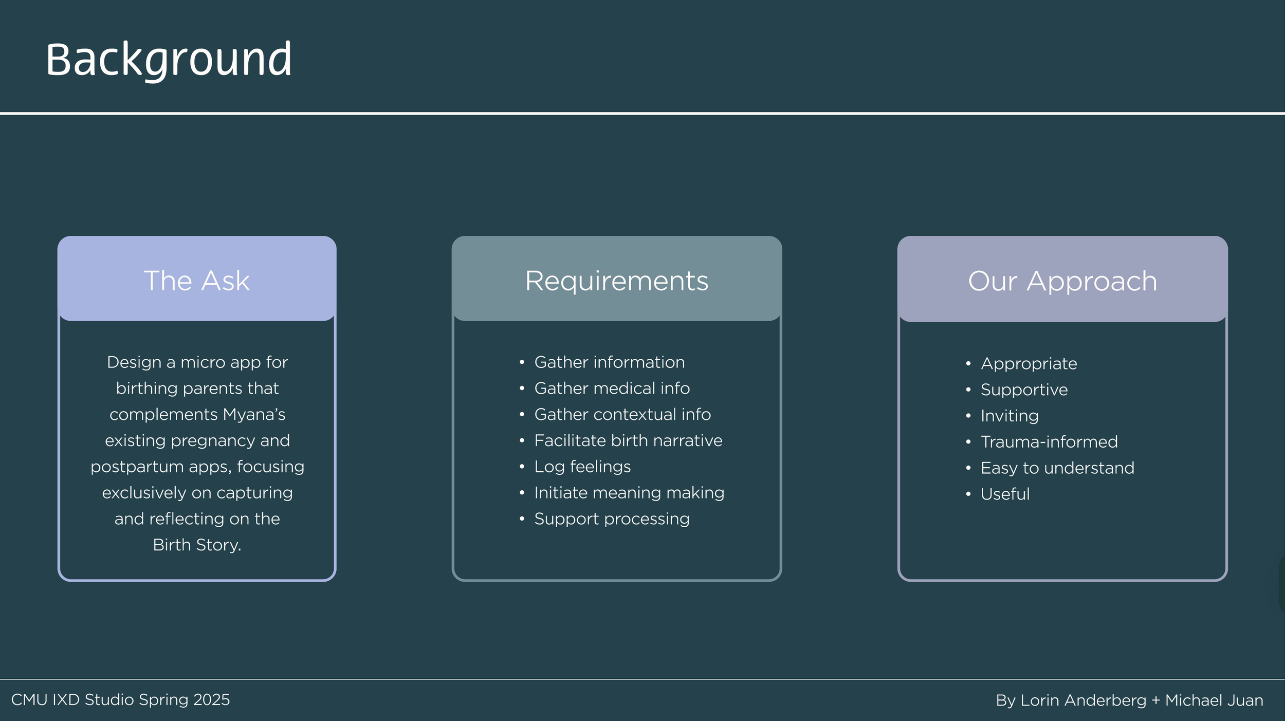
Design Challenge
Birthing parents lack systems of support before, during, and after the experience of giving birth, which is often overshadowed by the needs of a newborn.
How might we create an app that will help birthing parents and their loved ones prepare to document, record, and reflect on the process of giving birth in such a way that balances the logistical and emotional aspects of the experience?

Concept
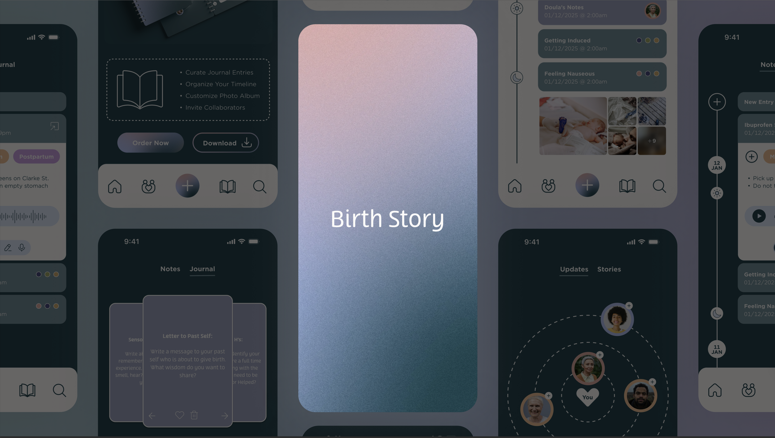
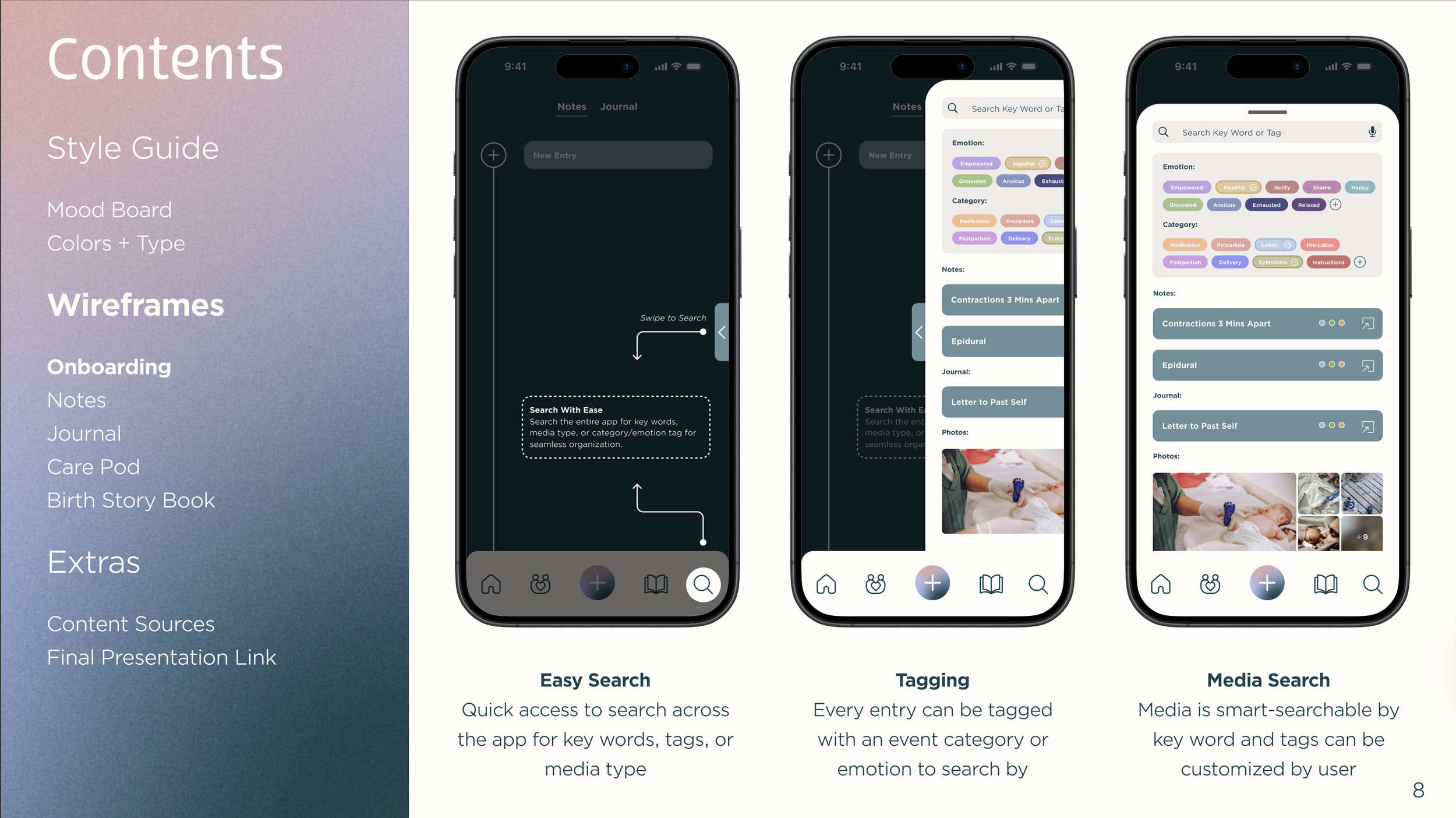
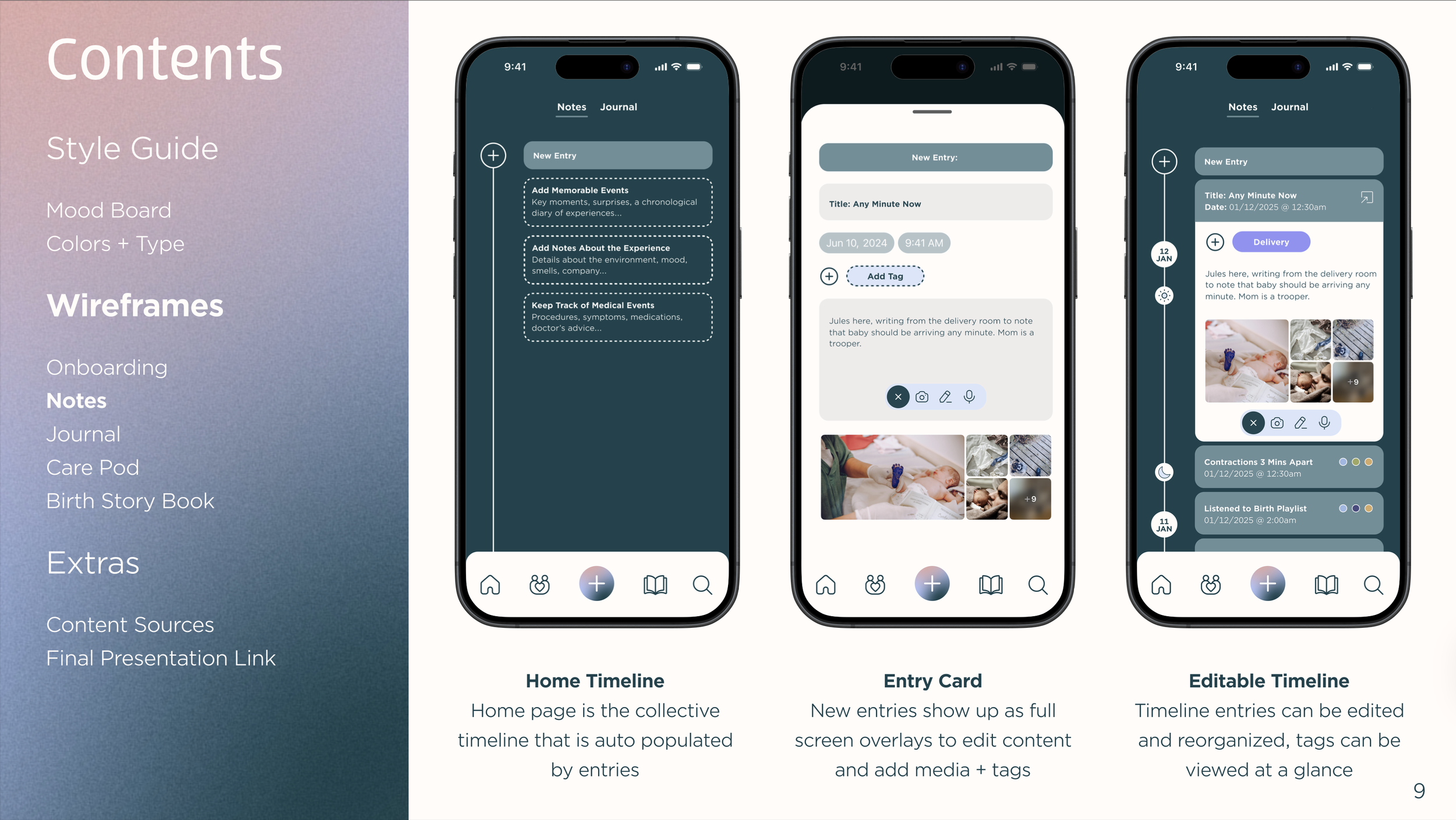
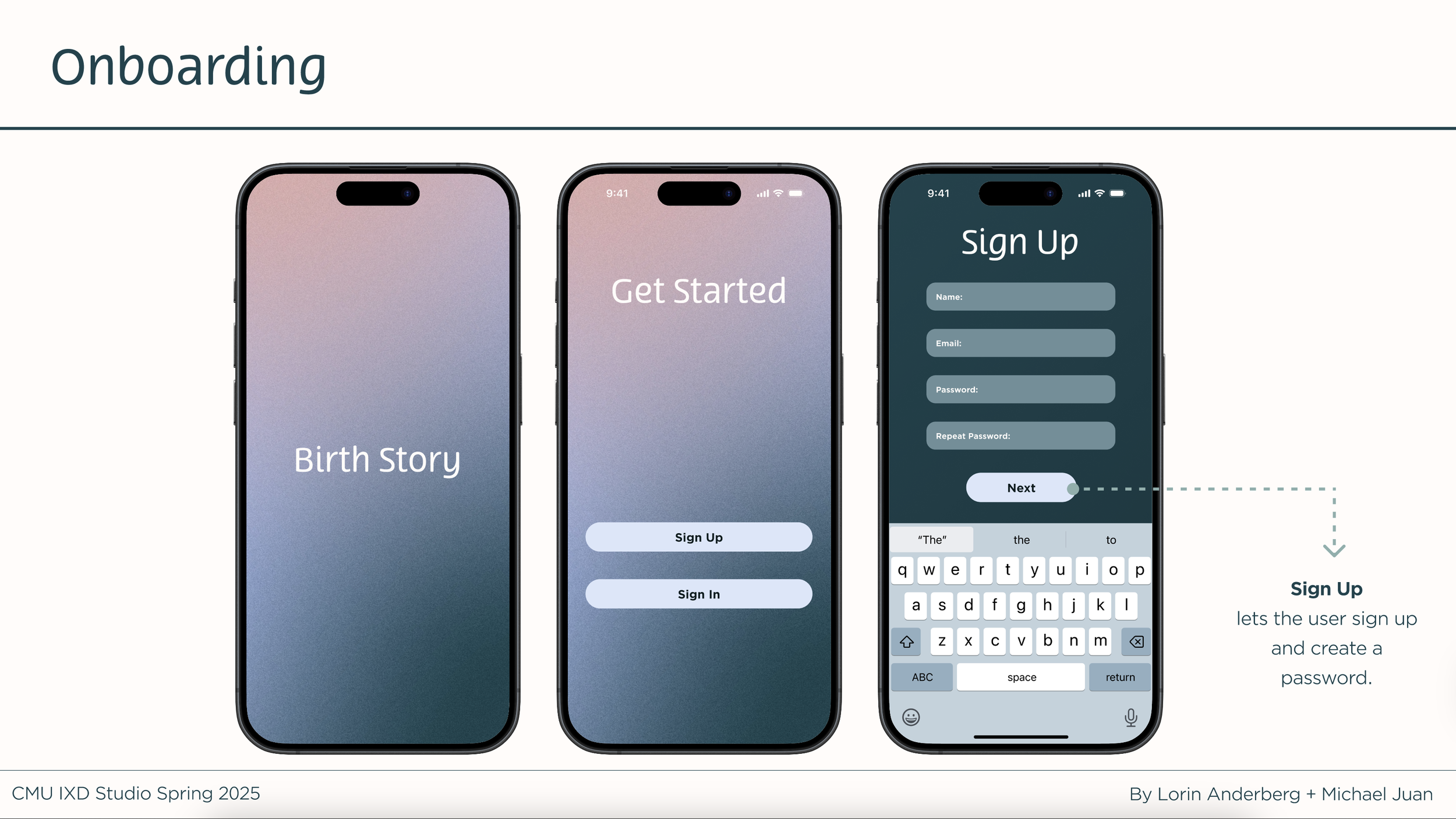
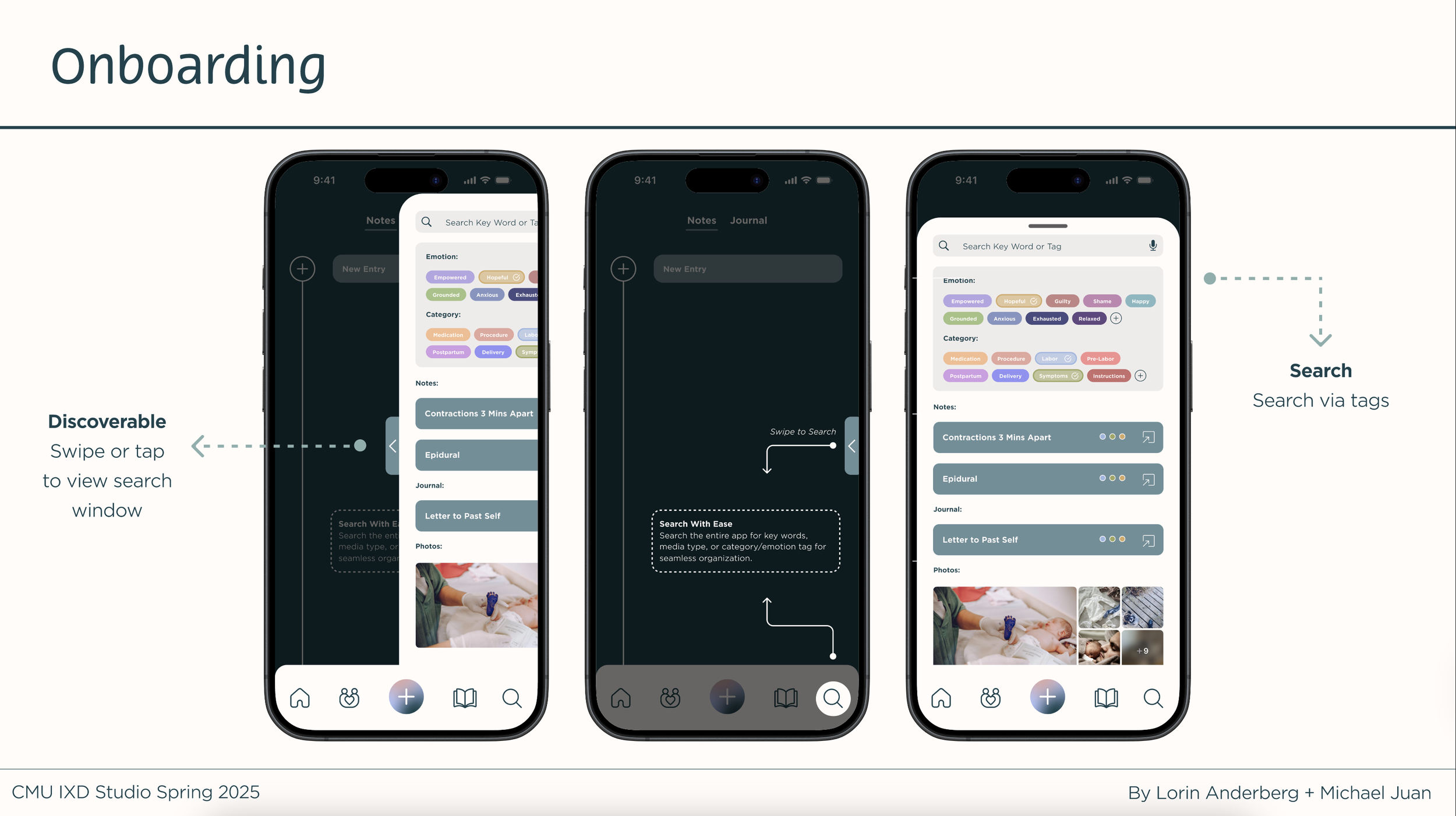
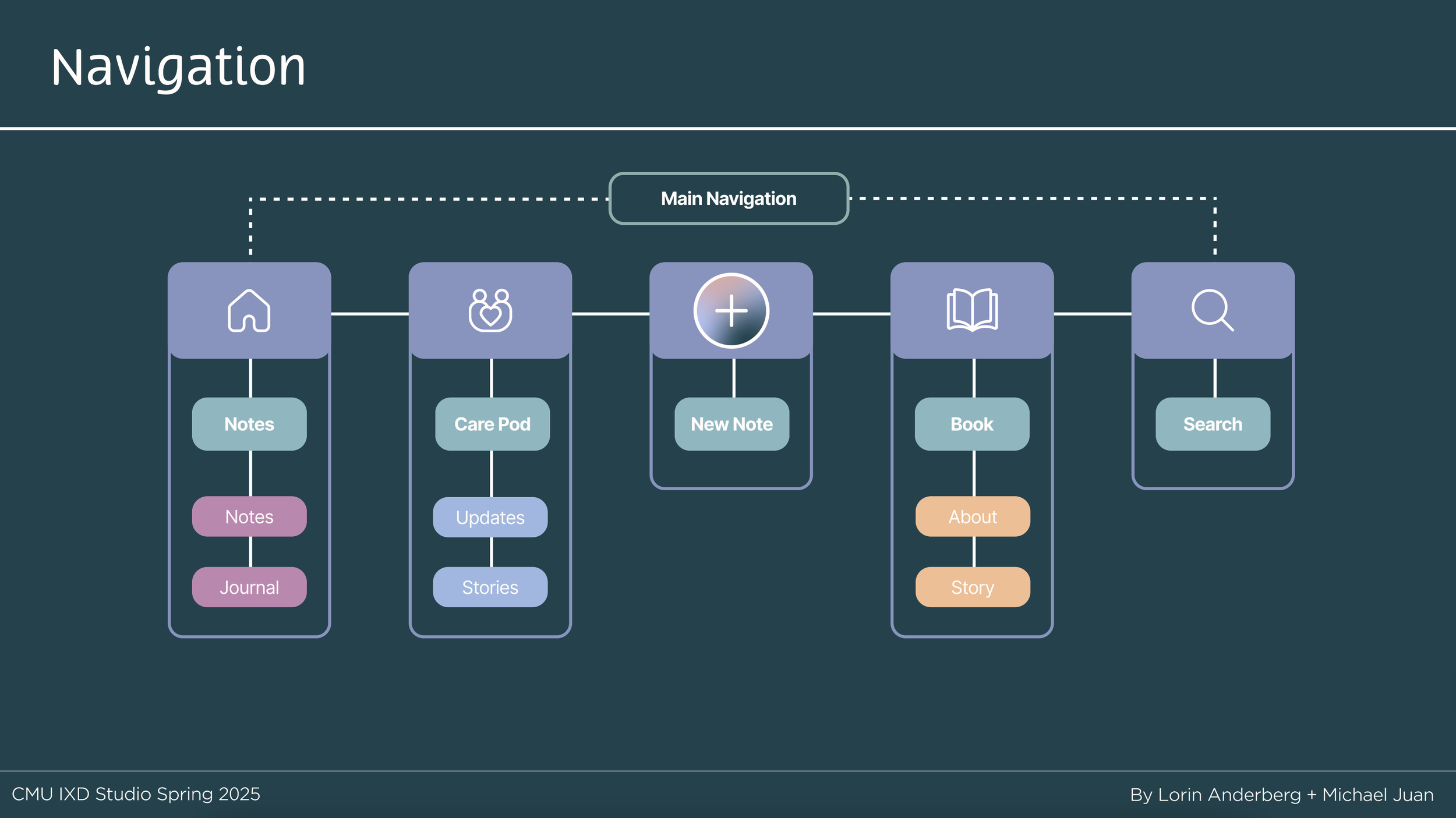
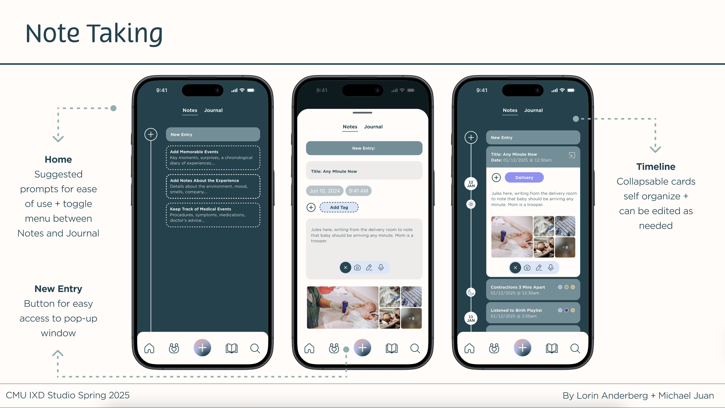
Users are quickly onboarded with clear examples and can toggle between notes and journal entries in a chronological timeline. Thoughtful prompts guide reflection on the birth experience, while keyword tagging enables easy search.
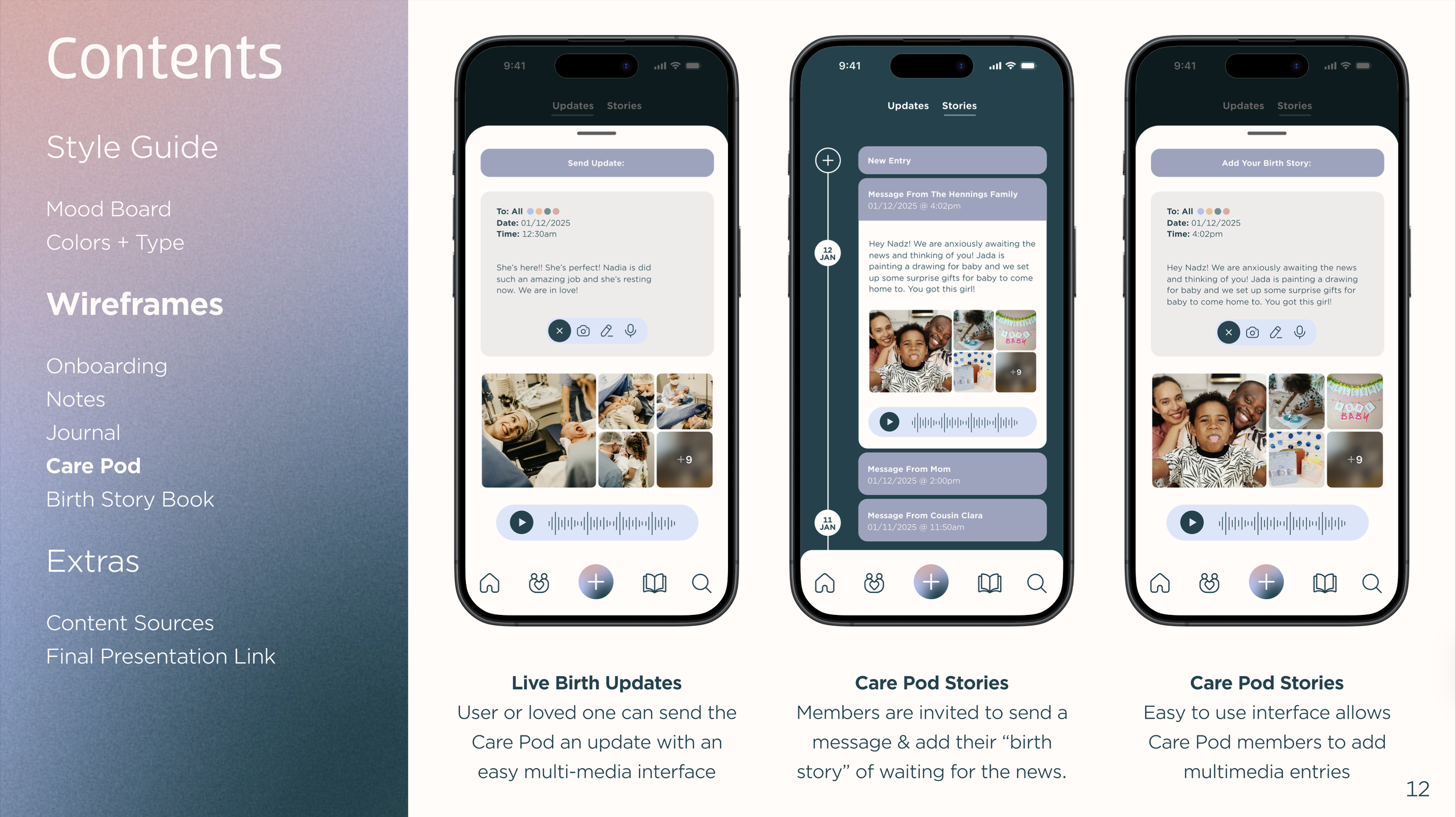
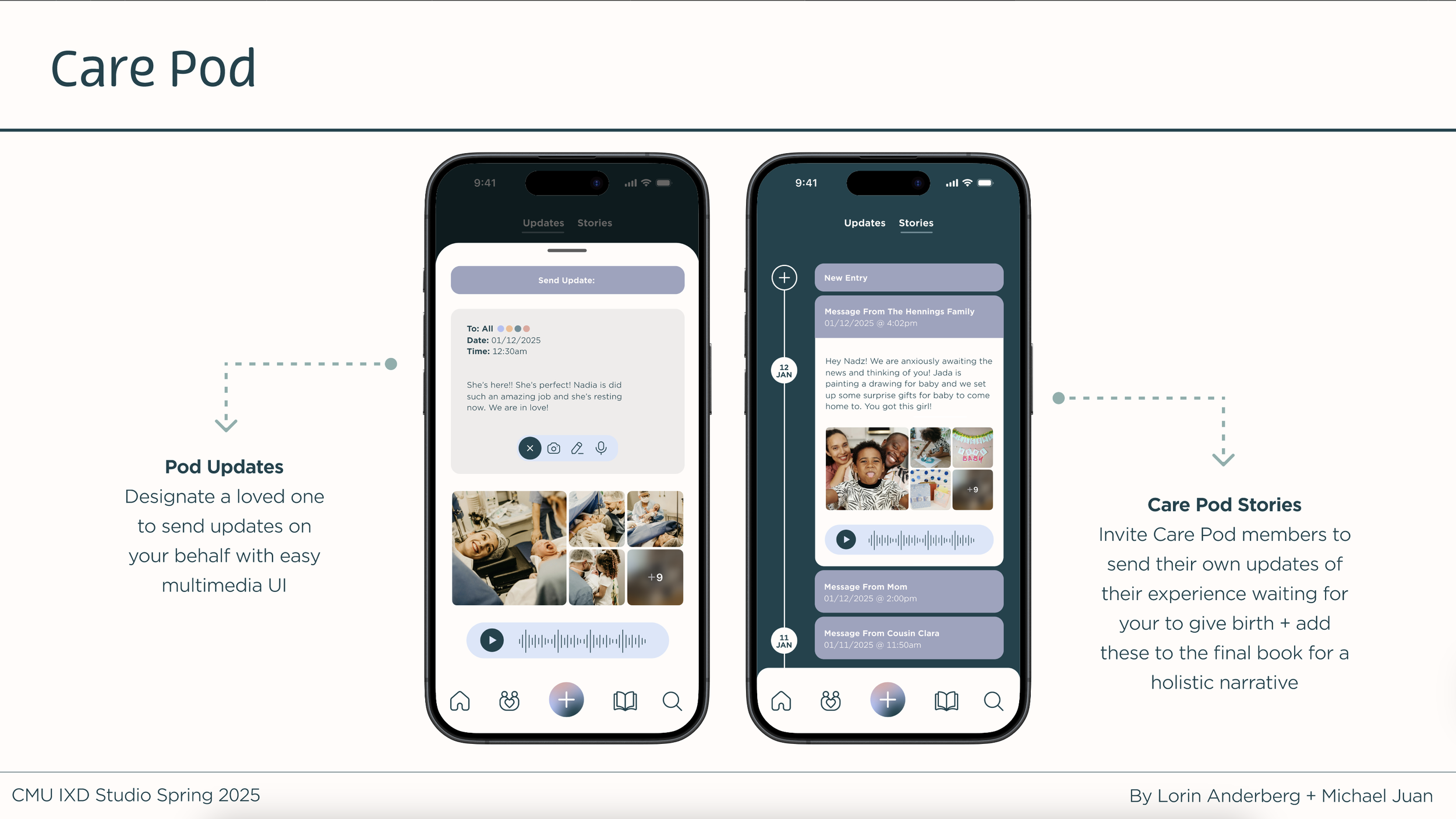
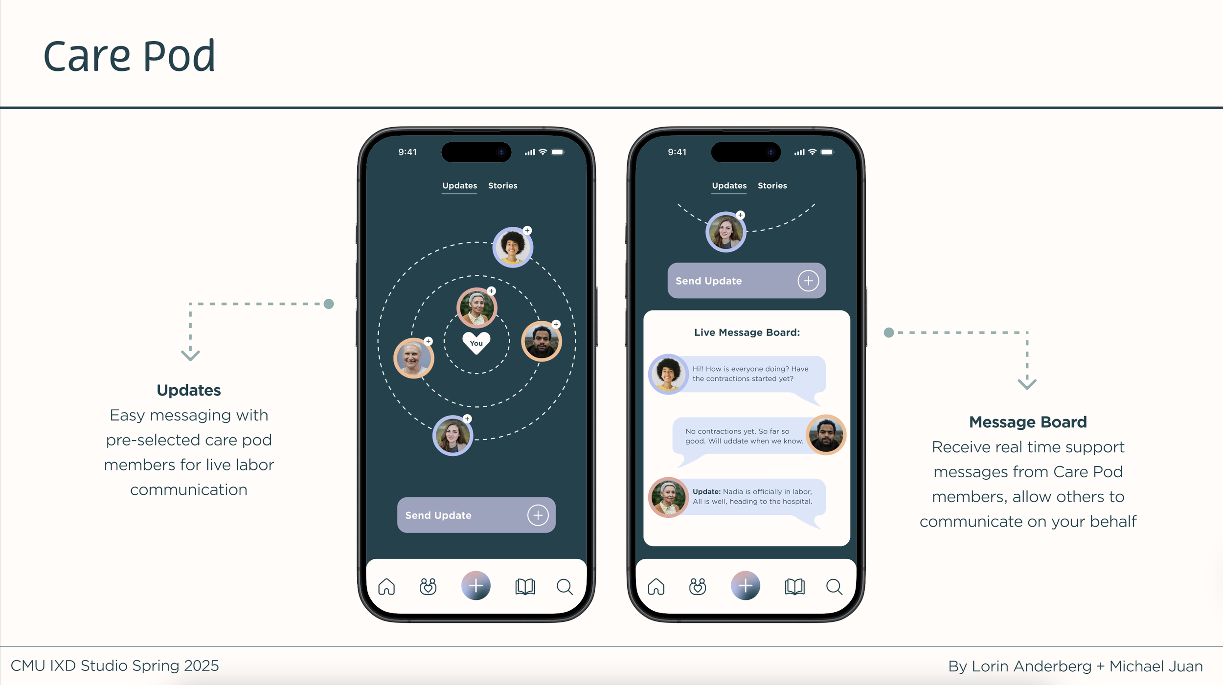
Research revealed users want to collaborate with loved ones, leading to the Care Pod feature—a curated inner circle that shares supportive messages and receives birth updates.


Brand Identity
We wanted the interface to feel calming, knowing that this app would be used in wee hours of the morning or in harsh hospital light. We intended for it to feel organic and emotionally supportive—creating a safe space for difficult emotions and uplifting moments alike. We also wanted it to feel similar to the parent app, Myana, so we created a new gradient to match Myana’s gradient style.


Timeline + Process
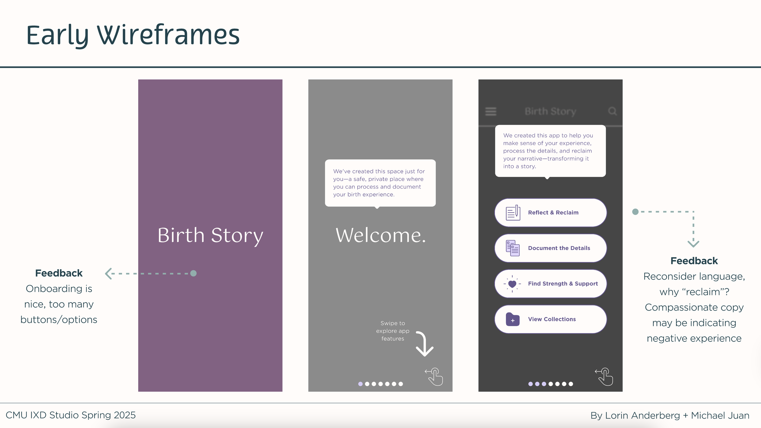
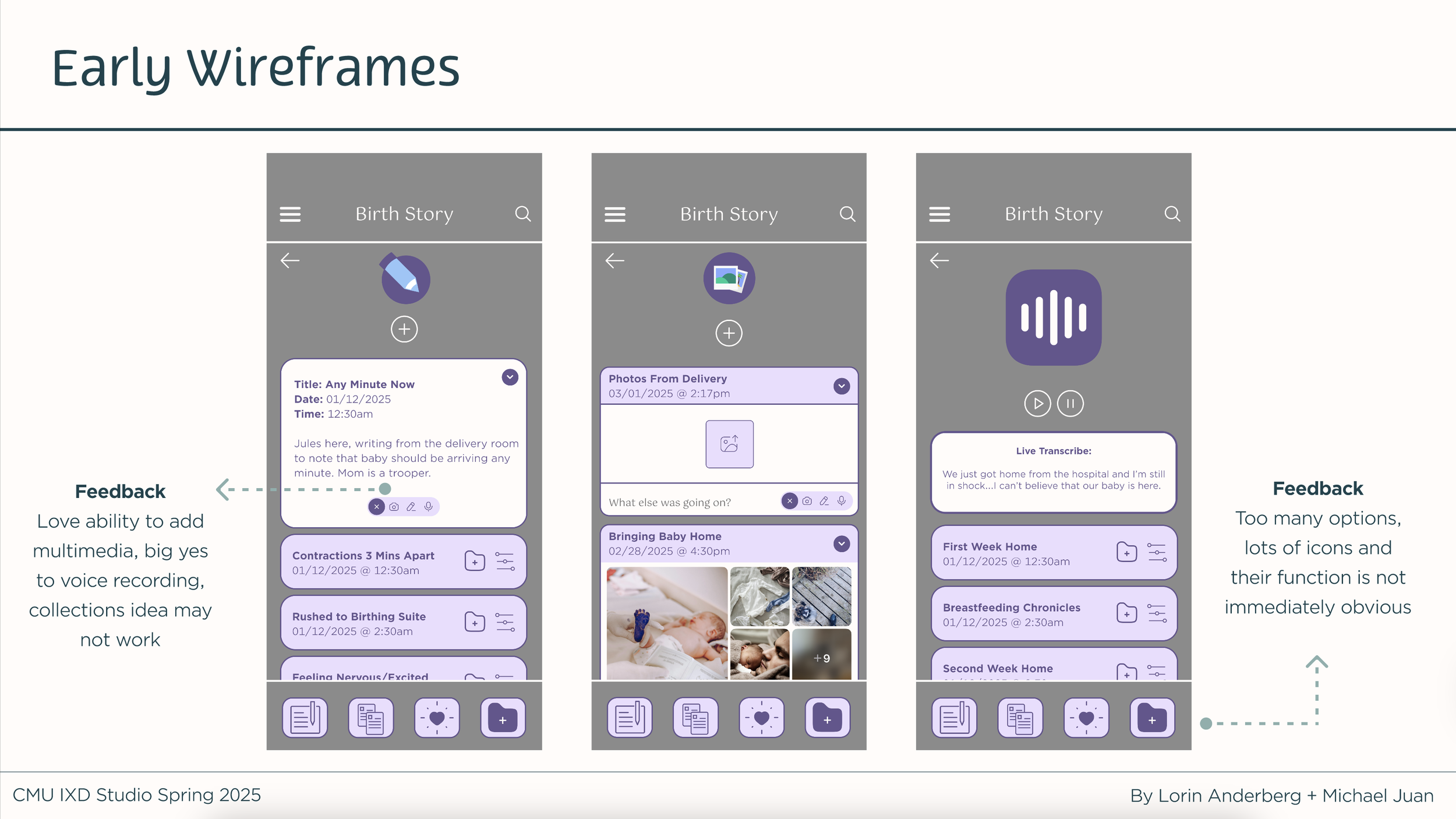
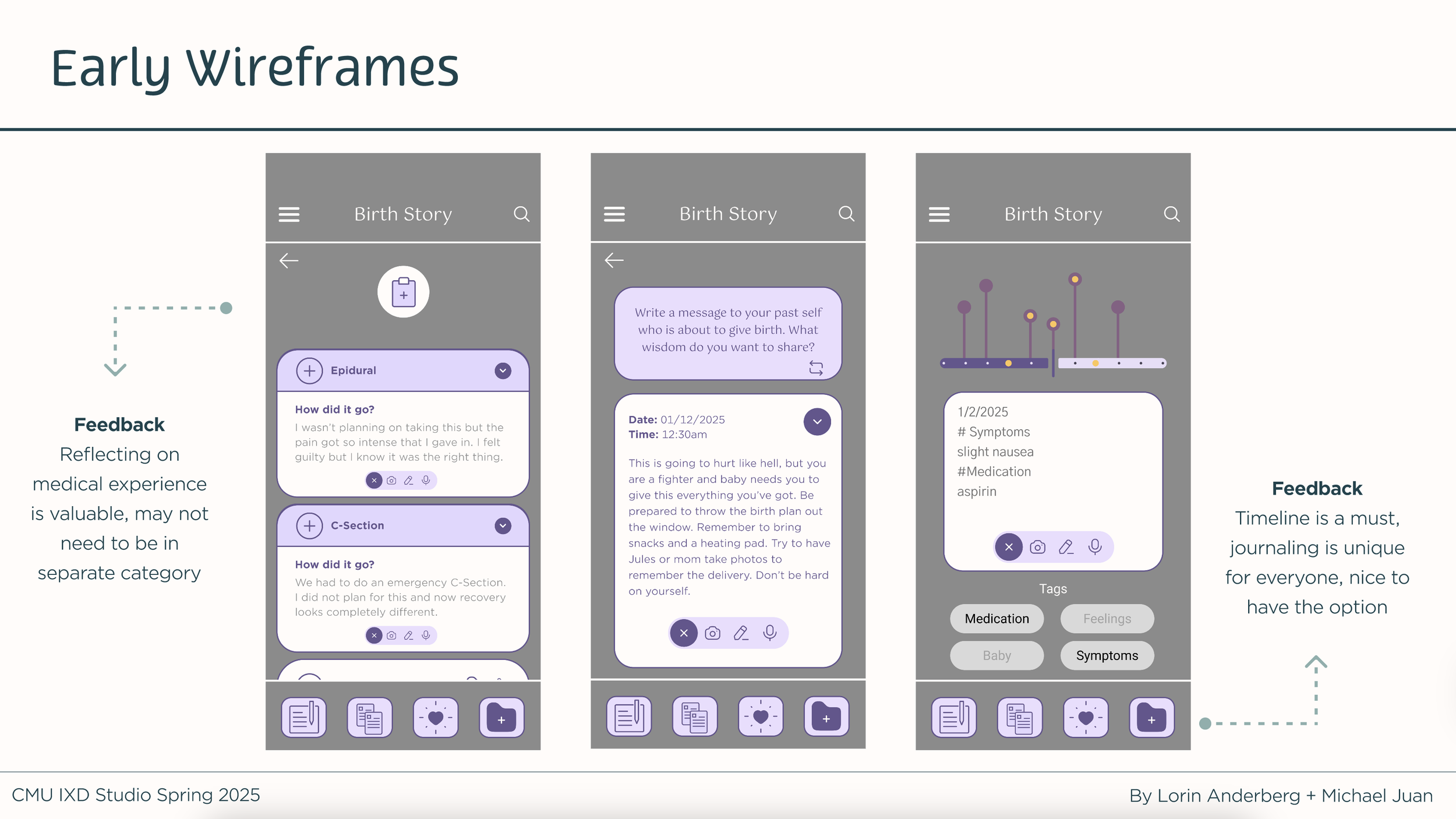
We interviewed 7 parents to learn about their birth experiences, and many reported that their experiences were traumatic and that they lacked tools to process them. We created lo-fi wireframes that attempted to offer as many tools as possible but through feedback we learned that simple is better for postpartum brain fog.
Our original approach to the copy was highly trauma-informed, but feedback revealed the language to be leading toward assumptions of a negative experience. While negative experiences are reflected in the data, we decided to take a more holistic, user-driven approach to the content with an emphasis on connecting with community.
Research I
1 Week
Meet Client
Study Requirements
Gather Information
Research II
1 Week
Internet Research
Design Principles
Research Protocol
Ideation
1 Week
Lo-Fi Wireframes
Feedback
Info Architecture
Interviews
1 Week
Interview Parents (7)
Synthesize Findings
Iterate on Wireframes
Iteration
1 Week
Hi-Fi Wireframes
Feedback
Critique
Presentation
1 Week
Brand Refinement
Feedback
Final Client Presentation
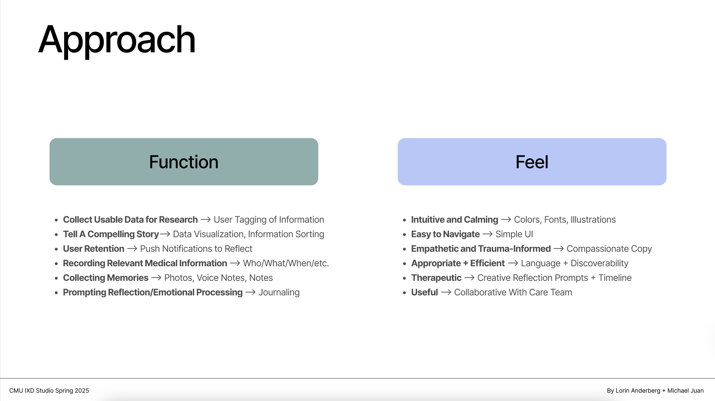
Approach
We wanted our app to be functional, intuitive, soothing, and efficient. We focused our early iterations on 4 key user flows: onboard, reflect, document, collect. We initially created a simple user flow, dividing the app into two primary functions: Document and Reflect.
However, after receiving parent feedback, we redesigned the home page to integrate both functions. This reduced barriers to entry and allowed users to immediately engage based on their needs in the moment.
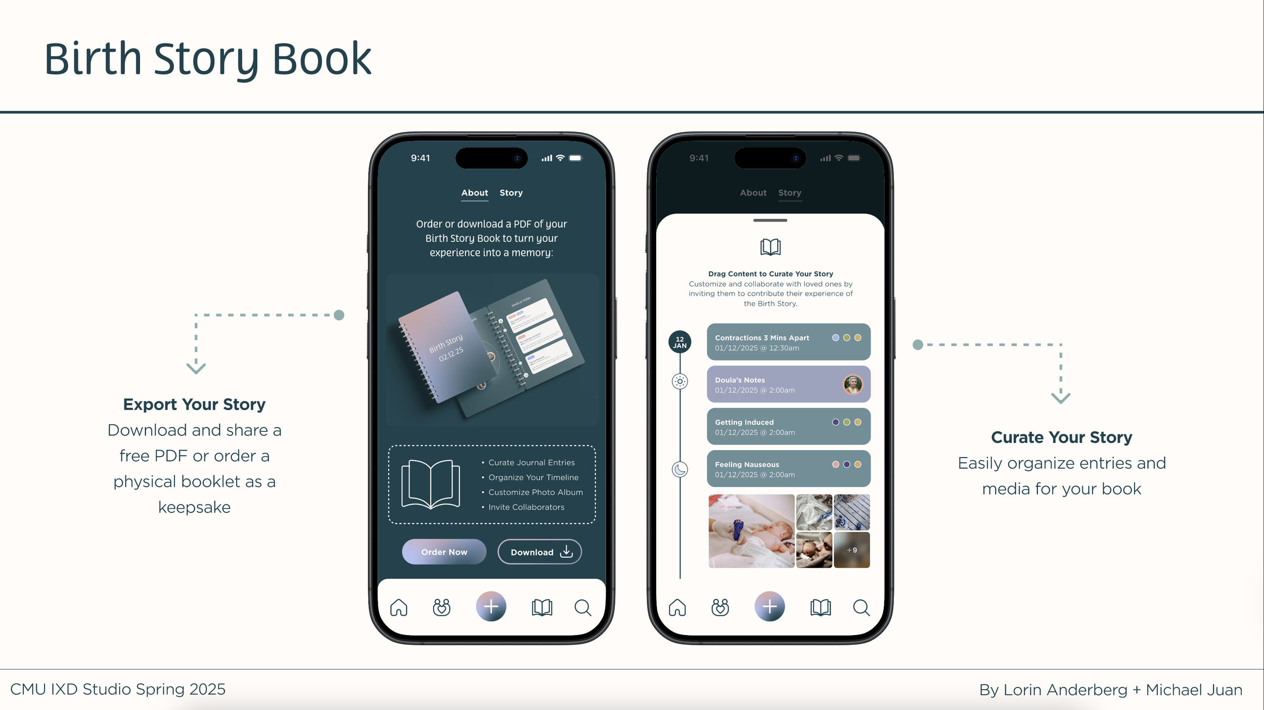
Because users don’t fully trust that digital memories will be preserved long-term, the Birth Story Book transforms entries into a physical keepsake via free PDF or affordable printed booklet. One parent noted:
“It would be tragic to lose those moments if the app disappeared someday.”


Outcomes
The concepts presented in this class will function as real, preliminary research and ideation for the eventual creation of a Birth Story app by the professors and the client. We had a successful and well-received presentation to the client who said: “I wish this could be real right now!”
If I could do this project again, I'd begin by simplifying. Identifying the core need early would have helped me stay focused, rather than trying to do too much at once. I also learned how important it is not to add anything to a wireframe that distracts from the main purpose or opens unnecessary avenues for feedback.