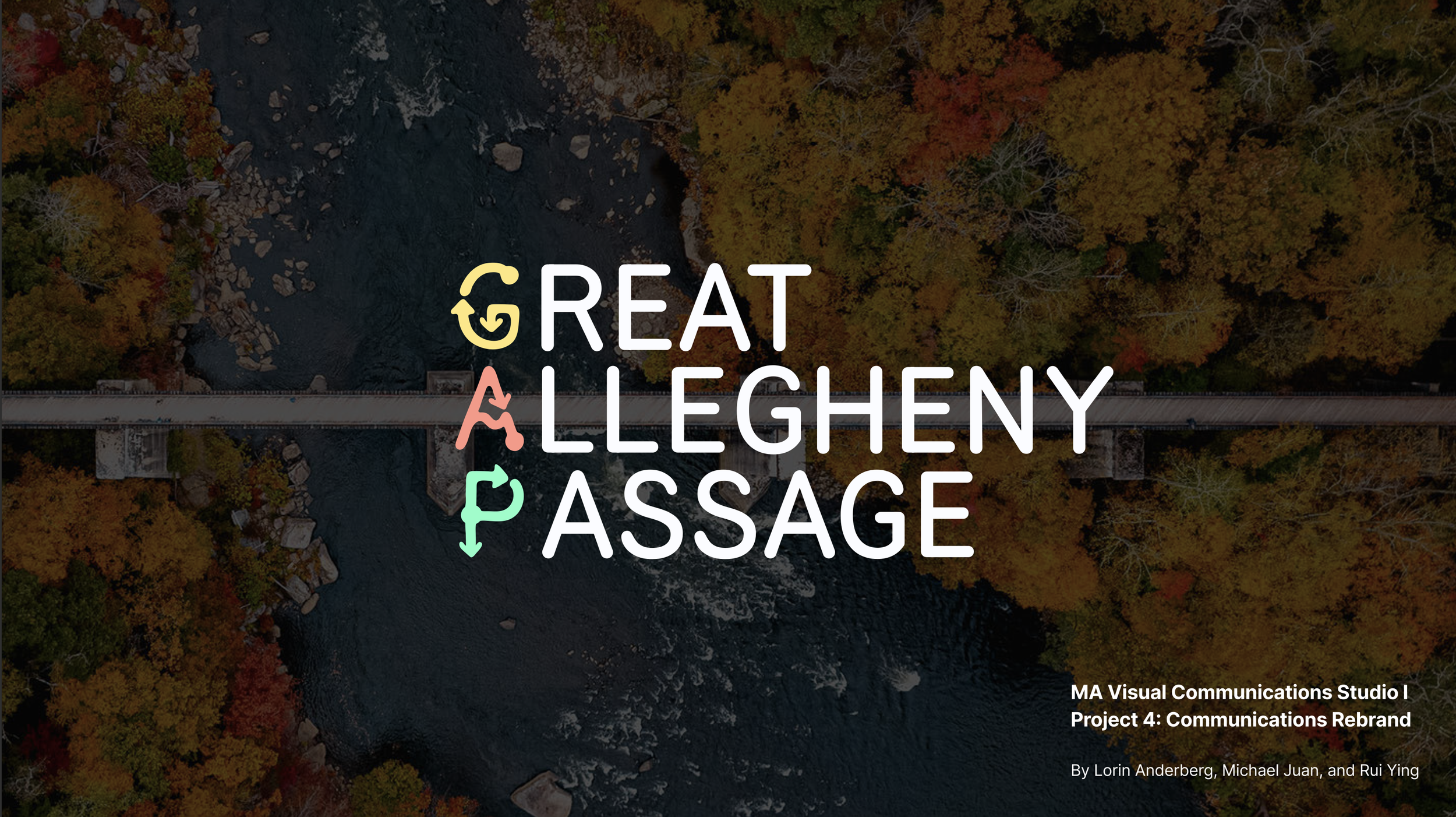
Bridging the G.A.P.
Visual Communications Re-Brand Campaign for the Great Allegheny Passage Trail
UX Research | Brand Identity | Animation
A comprehensive rebranding proposal featuring a campaign for inexperienced riders, GPS app prototype, printed materials, and environmental graphics. It was developed as the final project for a graduate visual communications studio and praised as a professor “favorite of all time” for this assignment over the years.
Course: CMU MA in Design, Visual Communications Studio
Team: Lorin Anderberg, Michael Juan, Rui Ying
Role: UX Research, Brand Identity, Animation
Tools: Figma, Adobe Illustrator, After Effects
Credits: Unsplash Images, Figma Community Templates, Mr MockUp
Duration: 5 Weeks
Design Challenge
Pittsburgh has a large transient student population and most residents are unaware of the GAP trail or experience barriers to experiencing this historic nature trail.
How might we rebrand the GAP trail to feel accessible and inviting to people with minimal experience in nature?
Concept
Our re-brand takes a playful approach to inviting diverse audiences outdoors. Our solution aims to empower people through knowledge. The campaign is called “Bridging the GAP” referring to the knowledge gap between Pittsburgh residents and the Great Allegheny Passage Trail Association.
We propose a new sister brand initiative that would catalyze more efforts to create inclusive nature experiences along the trail through awareness campaigns (merch, pamphlet, and environmental graphics) as well as a GPS app that makes planning easy and incorporates historical facts along the route.
Timeline + Process
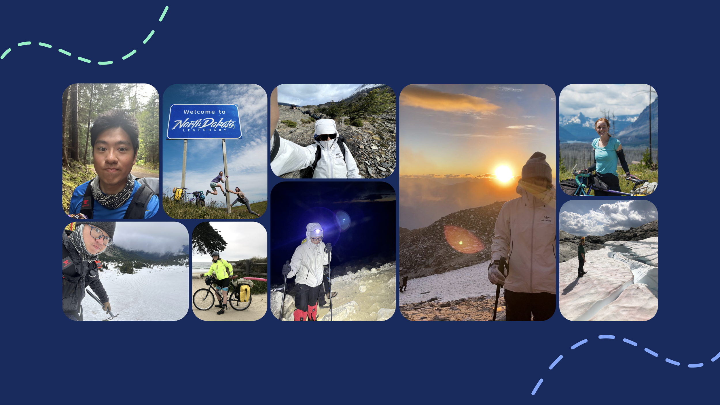
Our team shares a deep love for nature and the outdoors, which led us to explore local organizations aligning with this passion and to identify opportunities for improving visual communication. We selected the Great Allegheny Passage, a 150-mile non-motorized path that runs from Pittsburgh to Cumberland, MD.
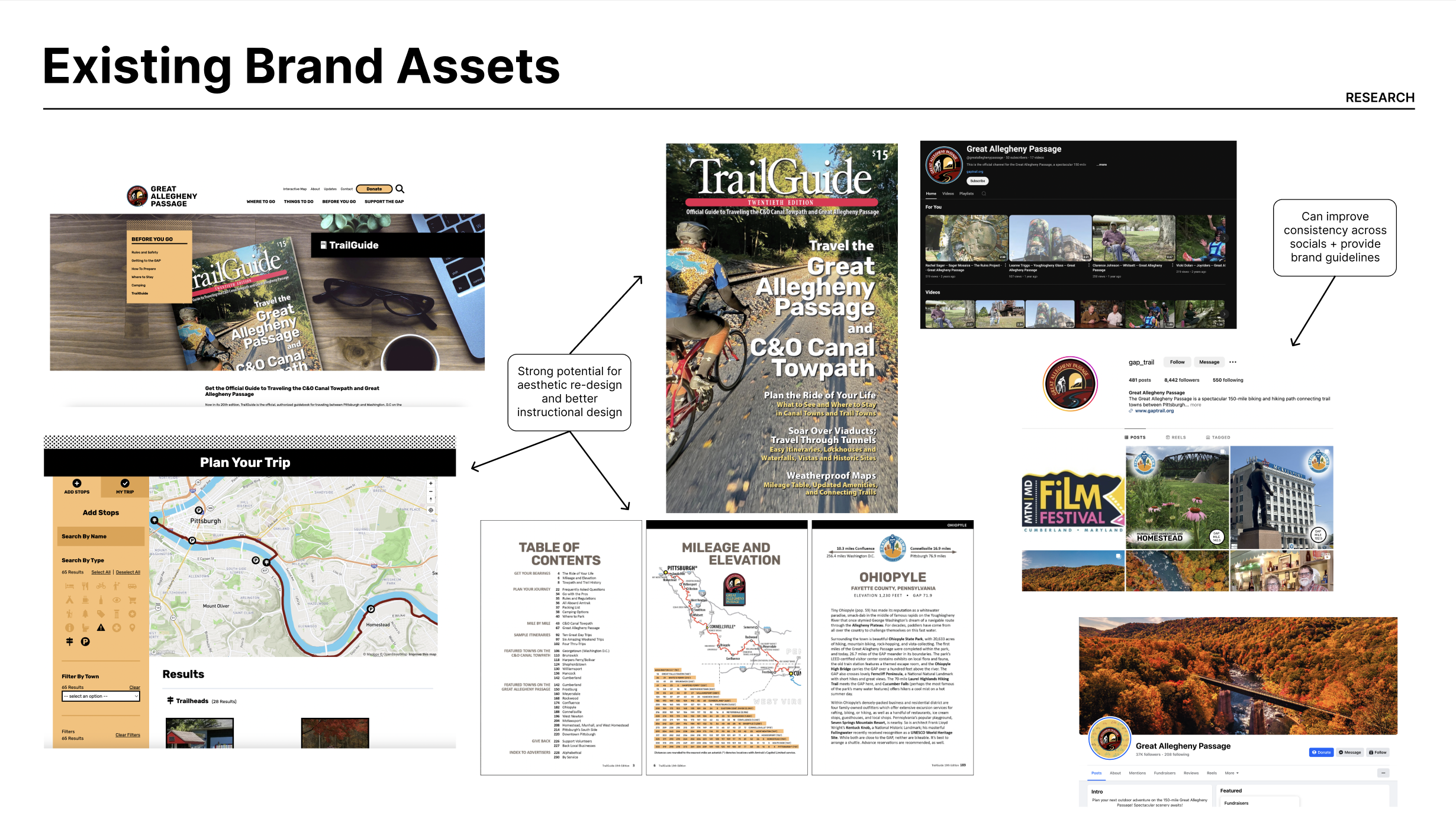
The existing website and brand are good so we decided to narrow our focus to bike touring the trail as a beginner. We spoke to the GAP association and learned that previous CMU grads designed the existing website and that they explored using an app in the past. We felt an enormous amount of potential from this project for real world results.
Ideation
1 Week
Research Protocol
Idea Generation
Internet Research
Research/Synthesis
1 Week
User Interviews
Field Research
Synthesis
Concept
1 Week
Crit
Branding
Lo-Fi Concept
Refinement
1 Week
Brand/Illustration Refinement
App Wireframes
Ecosystem Iteration
Presentation
1 Week
High-Fi Wireframes
Prototyping
Presentation
Research
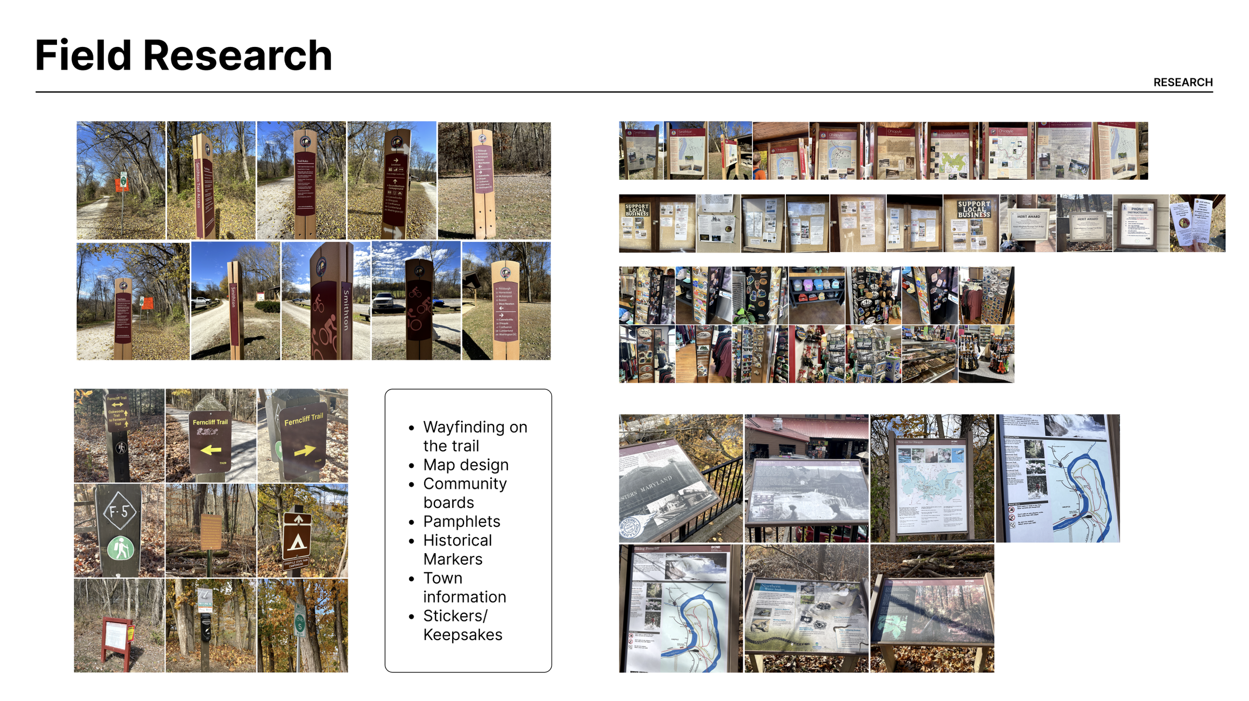
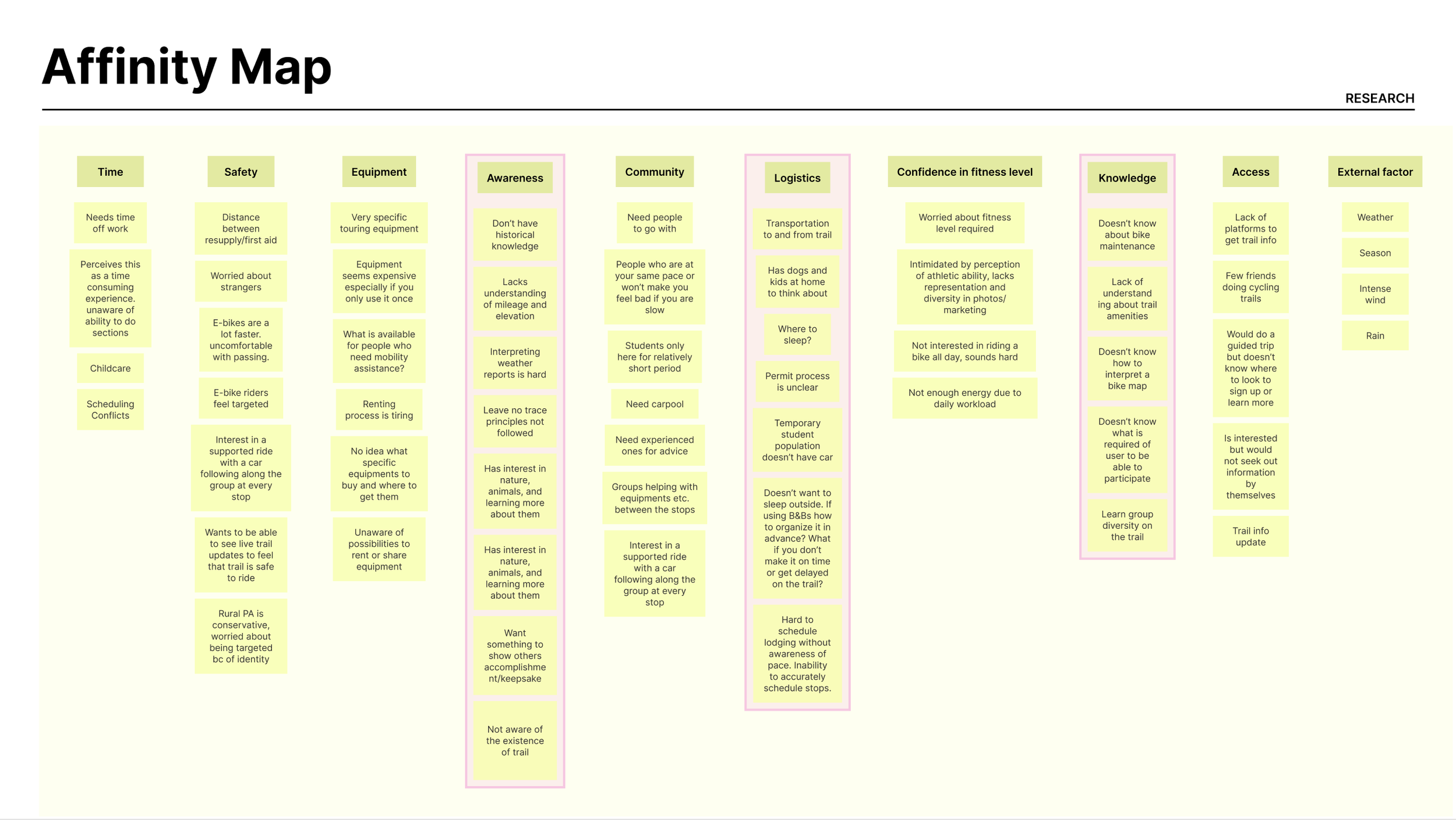
We drove out to Ohiopyle, the trail’s most popular trail town, to observe signage and speak to folks on the trail about bike touring. We also spoke to 30 friends, family members, and CMU students about the GAP trail and bike touring. Of those interviews, only one person said they were not interested in bike touring at all. This confirmed the potential that these solutions would be useful to our target users.
We developed personas and mapped out their journeys while planning a bike tour to identify key pain points and opportunities for our deliverables. We translated the most important pain points into key deliverables that would serve our user’s needs at every stage of their journey: Apparel (awareness + nostalgia), Environmental Graphics (awareness + wayfinding), Pamphlet, and the GAP App (trip planning + education).
Brand + Market Research
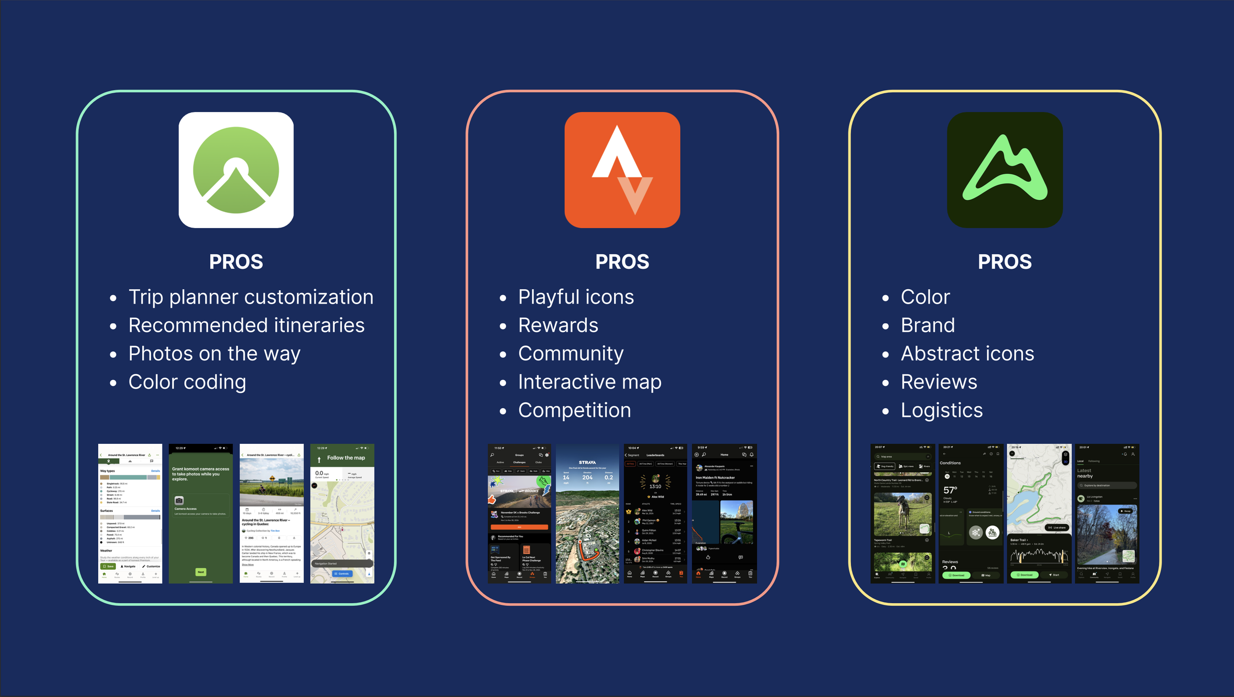
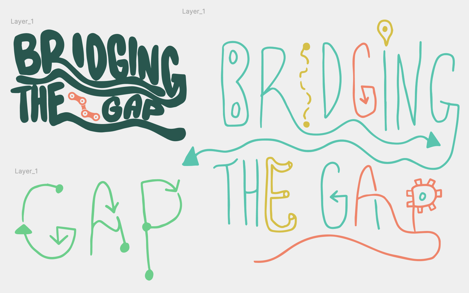
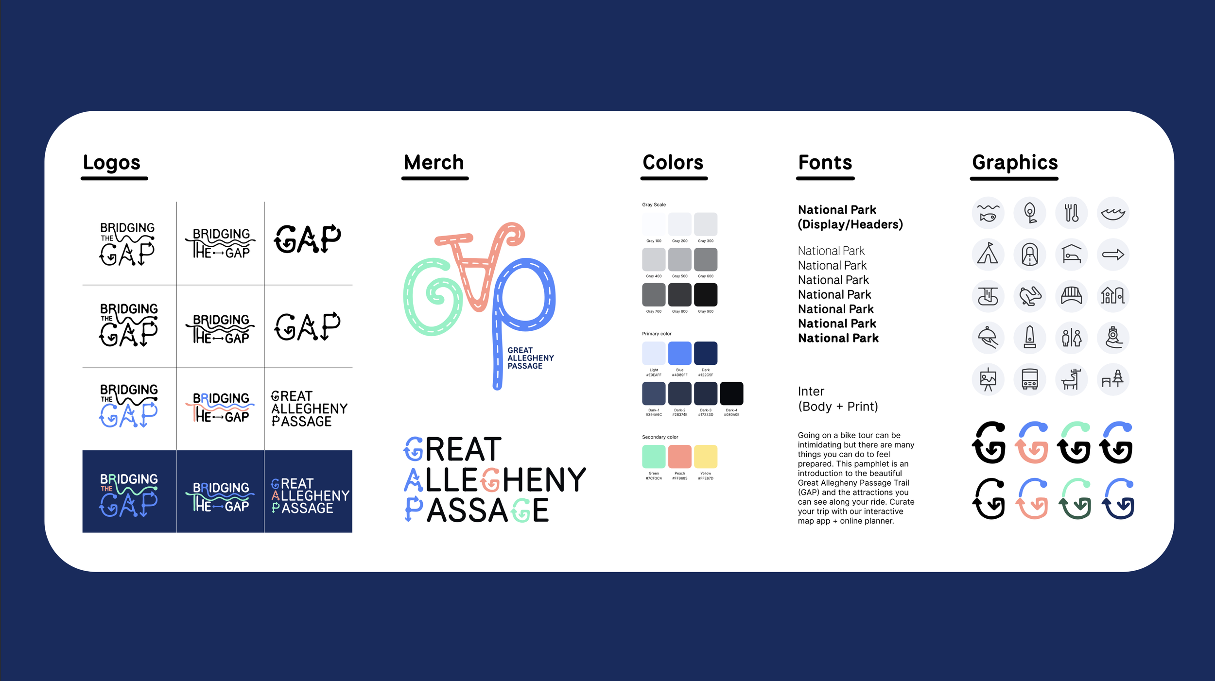
We looked at AllTrails, Strava, Komoot, Trail Forks, FarOut, and Gaia GPS. We assessed pros and cons of their user experience and decided to focus our efforts on playful design and customizable trip planning with strong imagery. We gathered mood board inspiration for the playful, colorful, and inviting tone that we wanted Bridging the GAP to embody. I started crafting logo ideas that would incorporate movement and biking. We chose the National Park typeface and I manually manipulated the letters to get a rounded shape with additional features.
We did some user research on colors that people associate with the outdoors. I also explored bridge and river shapes to bring home the metaphor. We received productive feedback at our weekly check-ins and presentations that helped us alter each deliverable to its most optimal state. The main feedback was to get our style aligned and go for a line-art approach and to make sure everything felt cohesive. We decided to incorporate apparel in case our signage or mural idea didn’t pan out.
Asset Ecosystem
Four branded interventions designed to guide, inspire, and equip new users:
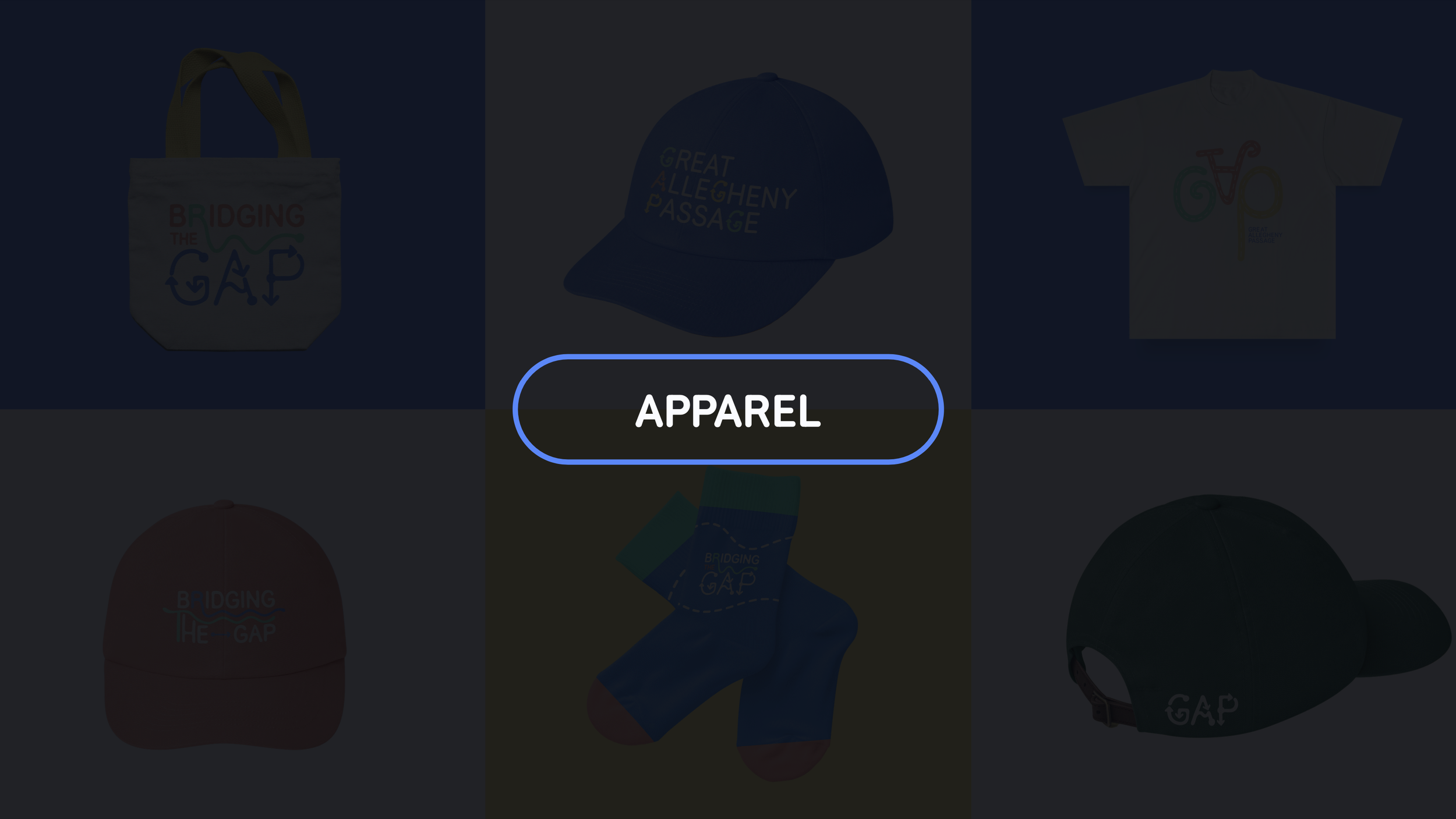
— Apparel (awareness + nostalgia)
— Signage + trail mural (awareness + wayfinding)
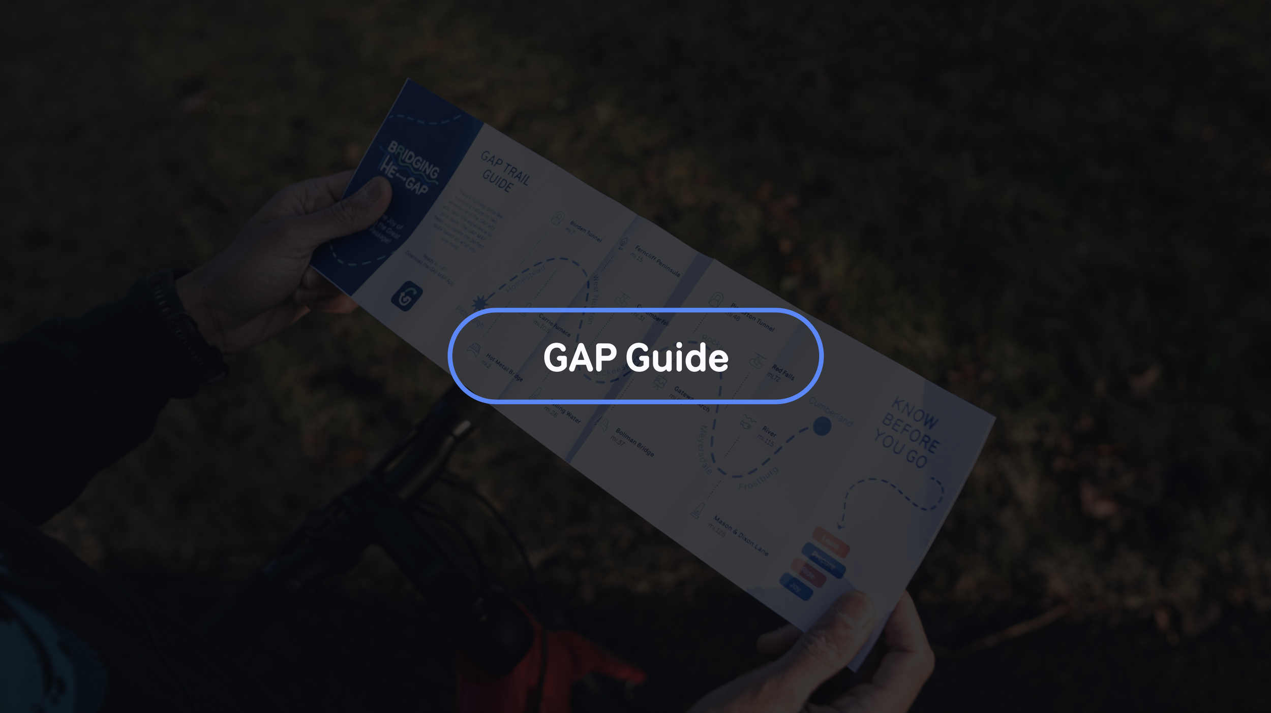
— GAP Guide Pamphlet (awareness + education + initiation)
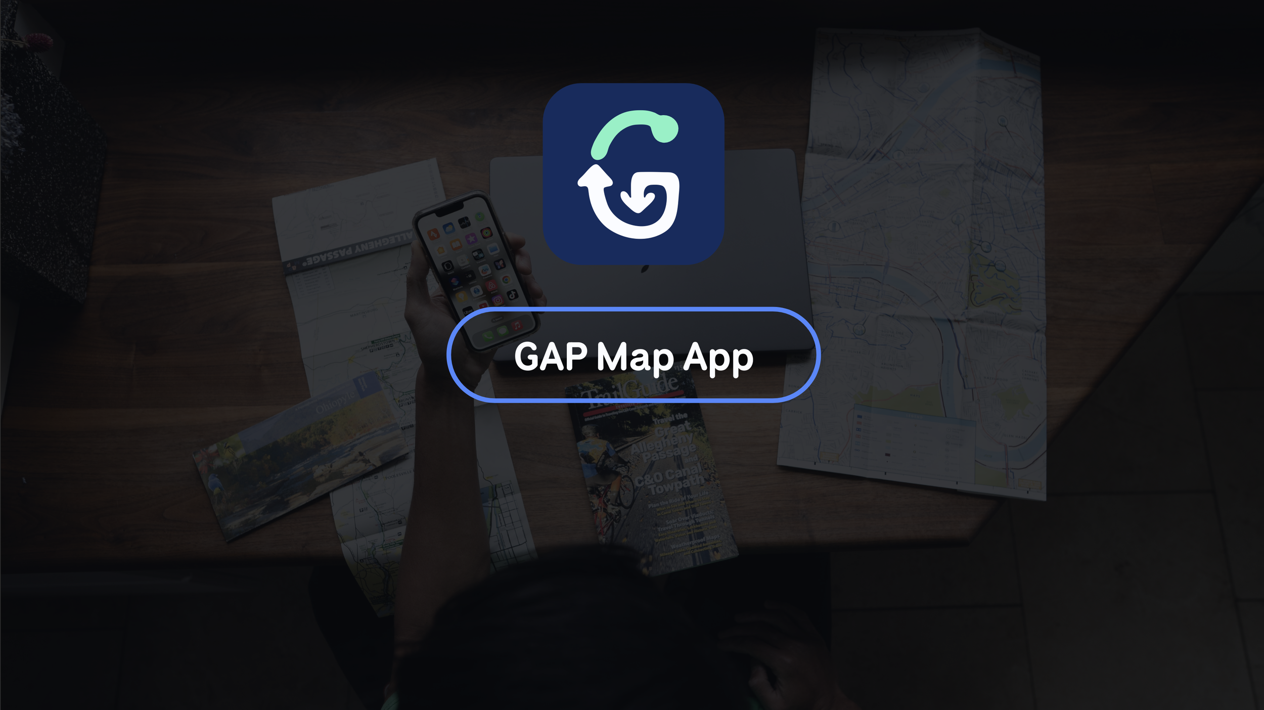
— GAP Map App (trip planner, tool, education, community)
In the short 5 weeks, we focused our attention on the most important assets, the brand and the app, which allowed us to ensure that the rest of our ecosystem was appropriately balanced and supportive of the movement we were trying to create: a world where novice nature lovers can feel empowered to adventure at their own pace. We received feedback that this was one of the best projects this professor had seen for this assignment as well as positive impressions from our audience.
Outcomes
Overall, we are very pleased with the outcome we achieved in a short amount of time. Our biggest takeaway was to unify our brand system. If I could do it again, I would try to iterate more casually. I have a tendency to need to create high fidelity iterations in order to know if I like them or not but it would serve the process better if I could iterate in a quicker and more lo-fidelity way.
Big props to my teammates: Michael who hand illustrated the icon system and did a ton of work to align our illustration styles. Rui who is a Figma wizard and owned our app prototype. Our diverse skillset and shared interests made for a stellar team.
