MindfulNest
Social-Emotional Learning Tool for Pre-K
UX Research | UX Design
During my 3-month research assistantship with Carnegie Mellon’s CREATE Lab within the Robotics Institute, I contributed wireframes to improve the back-end teacher experience of the MindfulNest app's dashboard.
Client: Carnegie Mellon University CREATE Lab, Robotics Institute + Trying Together
Team: Lorin Anderberg, Emily Hamner (Associate Director), Mike Tasota
Role: UX Research, UX Design
Tools: Figma
Credits: SVG Repo Icons, Unsplash Images
Duration: 15 Weeks
Design Challenge
The MindfulNest App’s first iteration has been a success and is ready for UX improvements. Teachers have expressed a desire for more features on the back-end. The task is to create wireframes for the team to review, iterate, then conduct a workshop to get educator feedback.
How might we balance the needs of teachers and students without creating additional burdens for often overwhelmed educators?
Context
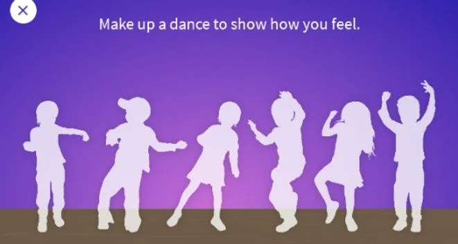
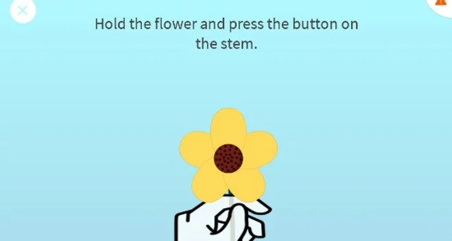
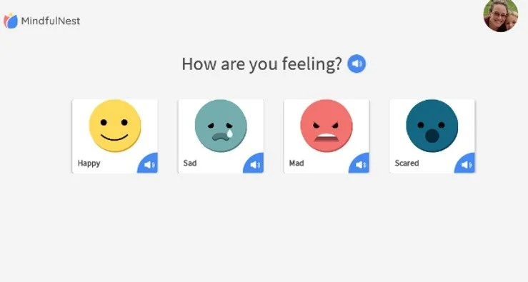
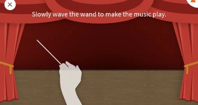
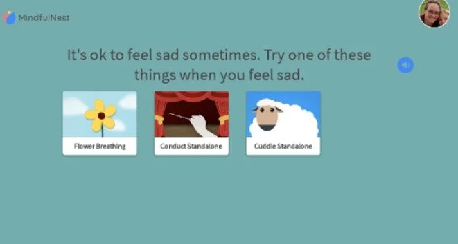
Carnegie Mellon University Robotics Institutes’s CREATE Lab developed MindfulNest. The app is designed to guide children through emotional regulation activities that help them identify and move through big feelings. The app is accompanied by physical tools that assist in mapping the activity: Blow on the Flower, Hug the Lamb, Wave the Wand, Dance it Out. Teachers use these tools along with curricula to integrate social-emotional learning into the classroom.
My mother was a special education teacher and I have long considered pursuing the field myself. I am particularly interested in early childhood development with an emphasis on social-emotional learning. I pitched myself as a research assistant after learning about CREATE Lab’s work in SEL and theym hired me on!
MindfulNest was already a few years running and ready to make new iterations on their interface design. We decided that I would spend my time exploring how to support the teacher back-end experience of the app.
CONSTRAINTS:
Time: ~6 hours/week available
Tech: App is offline only on Android
Familiarity: Teachers are comfortable with existing design
Research: Only one teacher feedback session
Existing Designs:
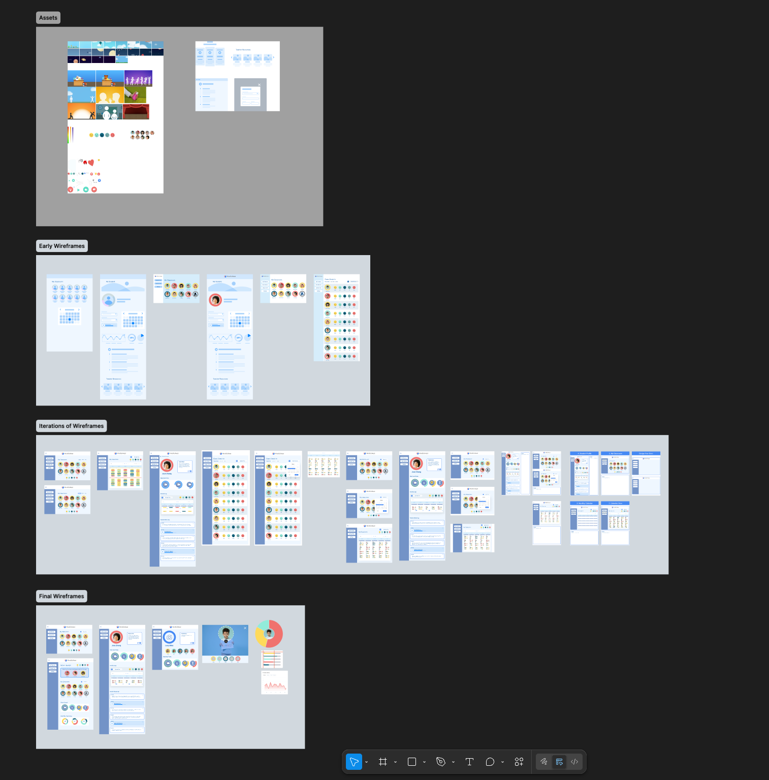
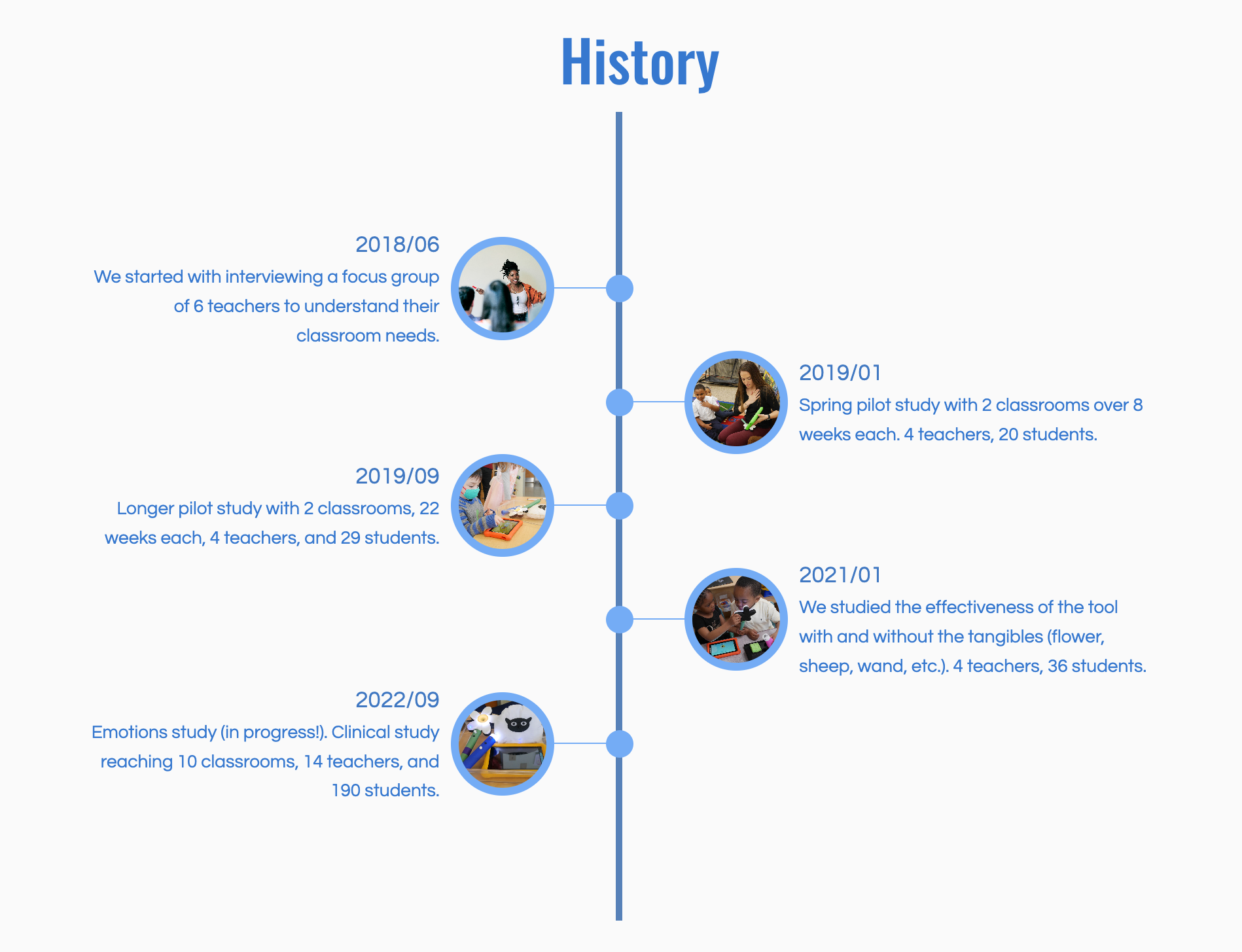
Timeline
The team met bi-weekly to review progress with occasional meetings with the partner client, Trying Together—a Pittsburgh non-profit supporting “high-quality care and education for young children by providing advocacy, community resources, and professional growth opportunities” including teacher training and support.
We were able to present our proposed wireframes to teachers at a roundtable hosted by Trying Together, where educators reported back on their classroom use of MindfulNest. Through participatory feedback and open discussion, we were able to get a better understanding of educator needs and desires.
Onboarding
3 Weeks
Observation of Existing App
Research on Topic
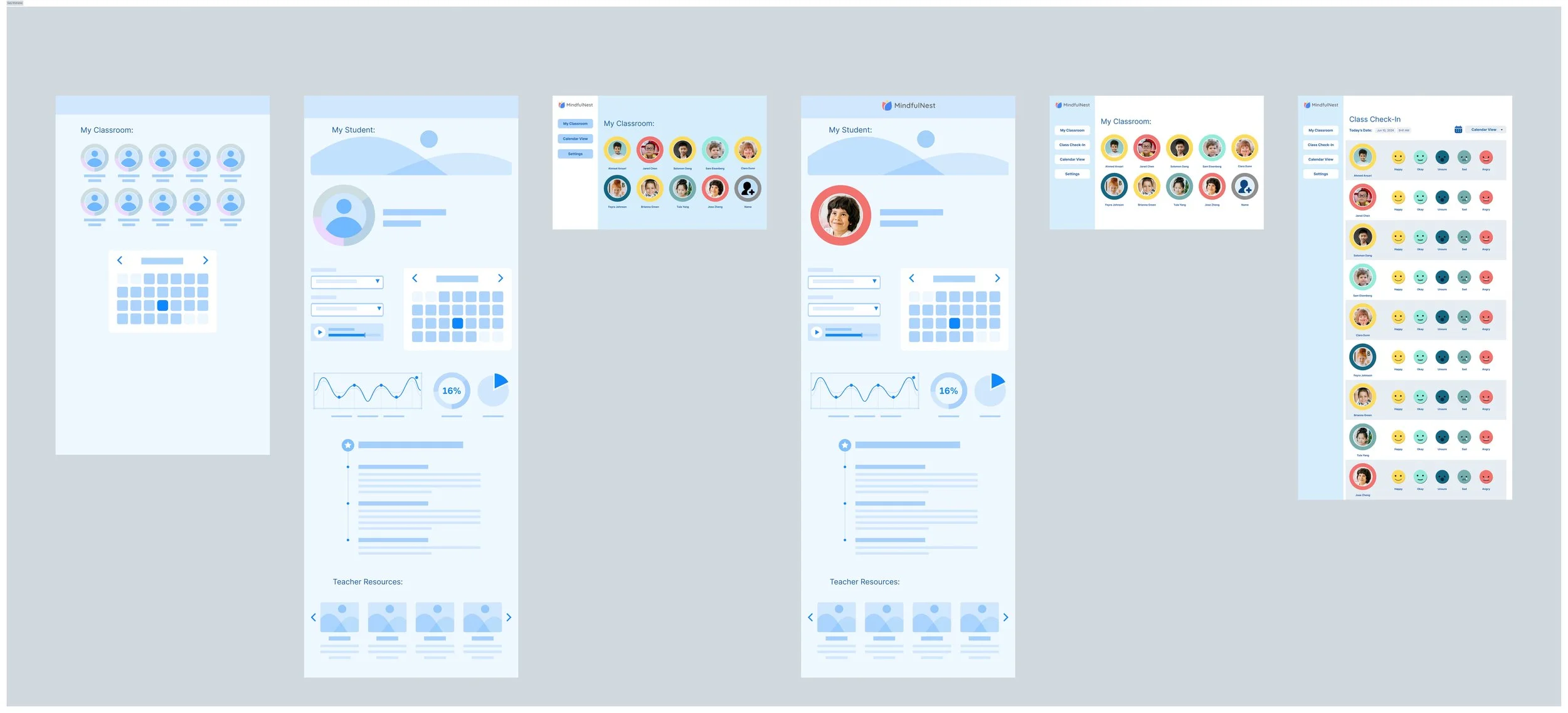
Early Sketches
Iteration I
Iteration II
3 Weeks
Wireframe Iteration
Workshop Prep
Spring Break
Refinement
3 Weeks
Trying Together Workshop
Teacher Feedback
Synthesis
Hand Off
3 Weeks
Wireframe Refinement
Figma File Prep
Review
Early Concepts
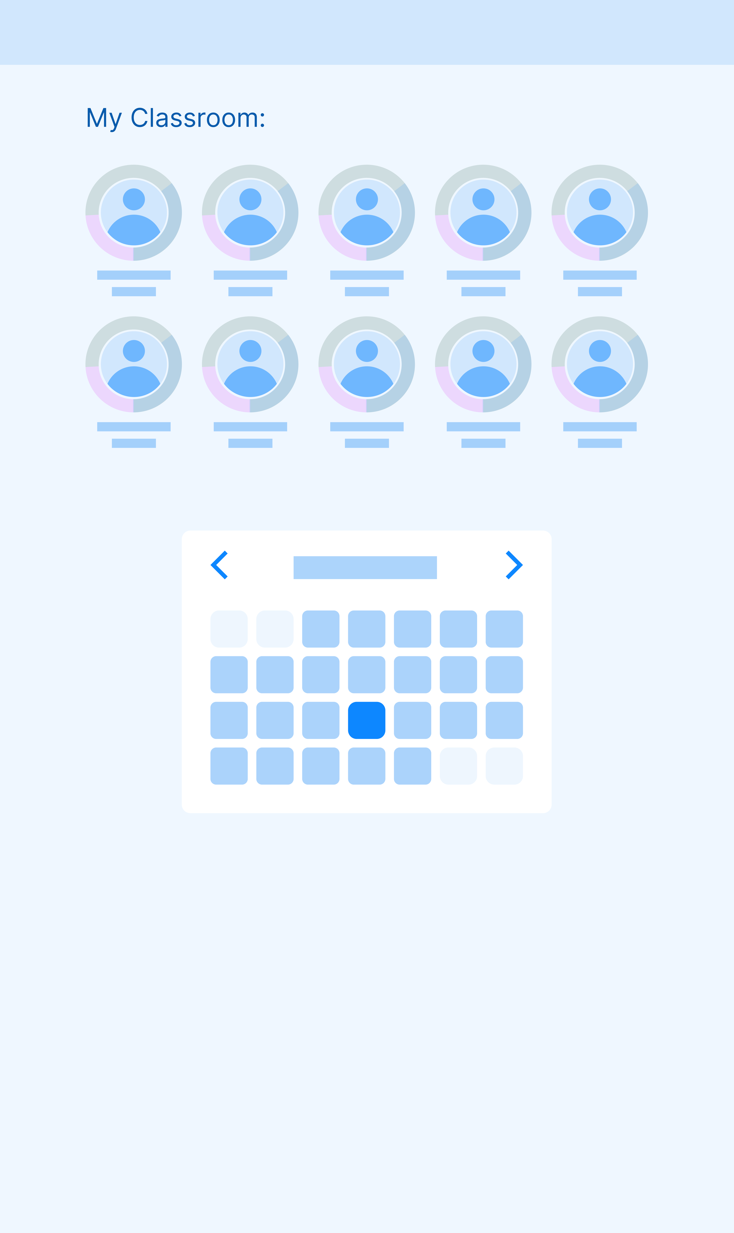
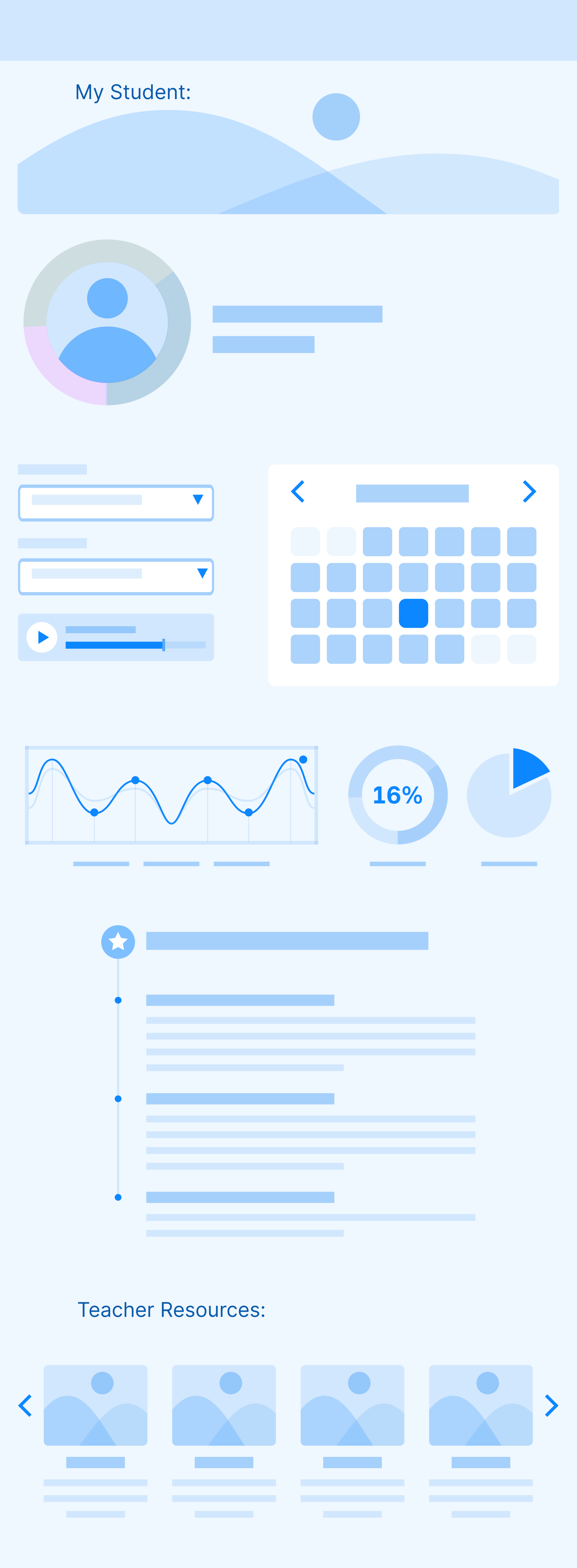
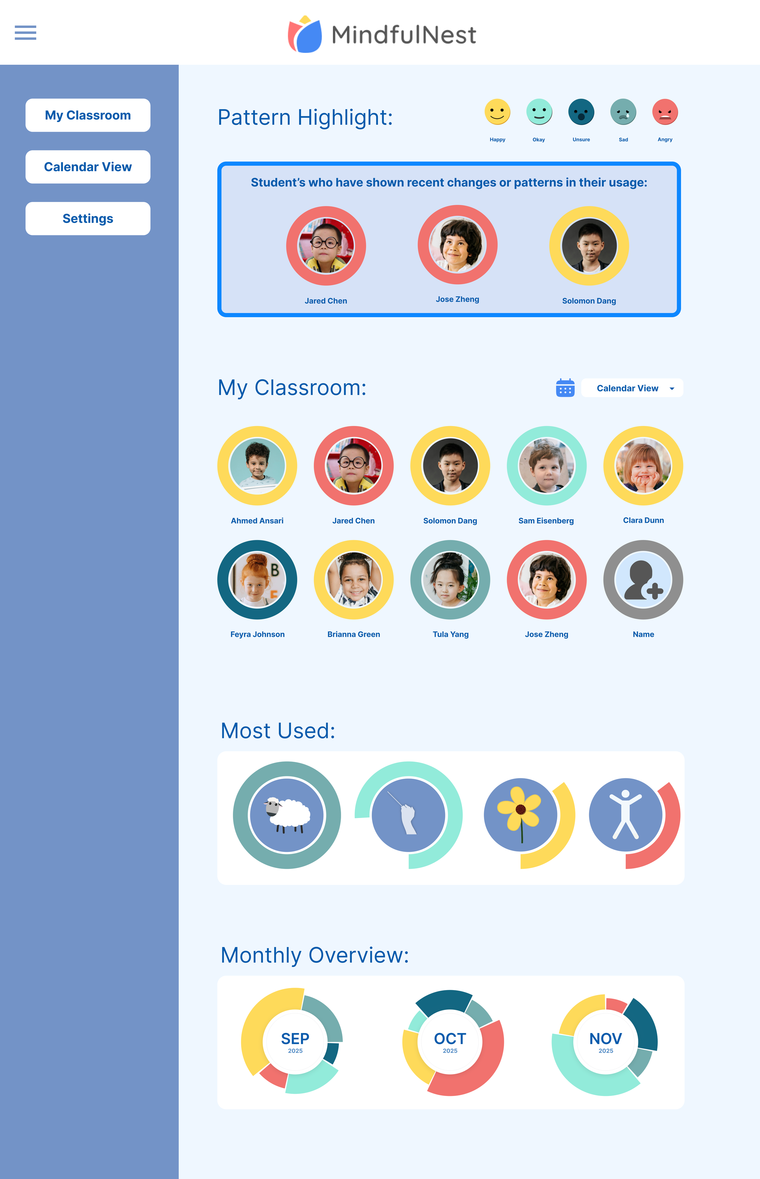
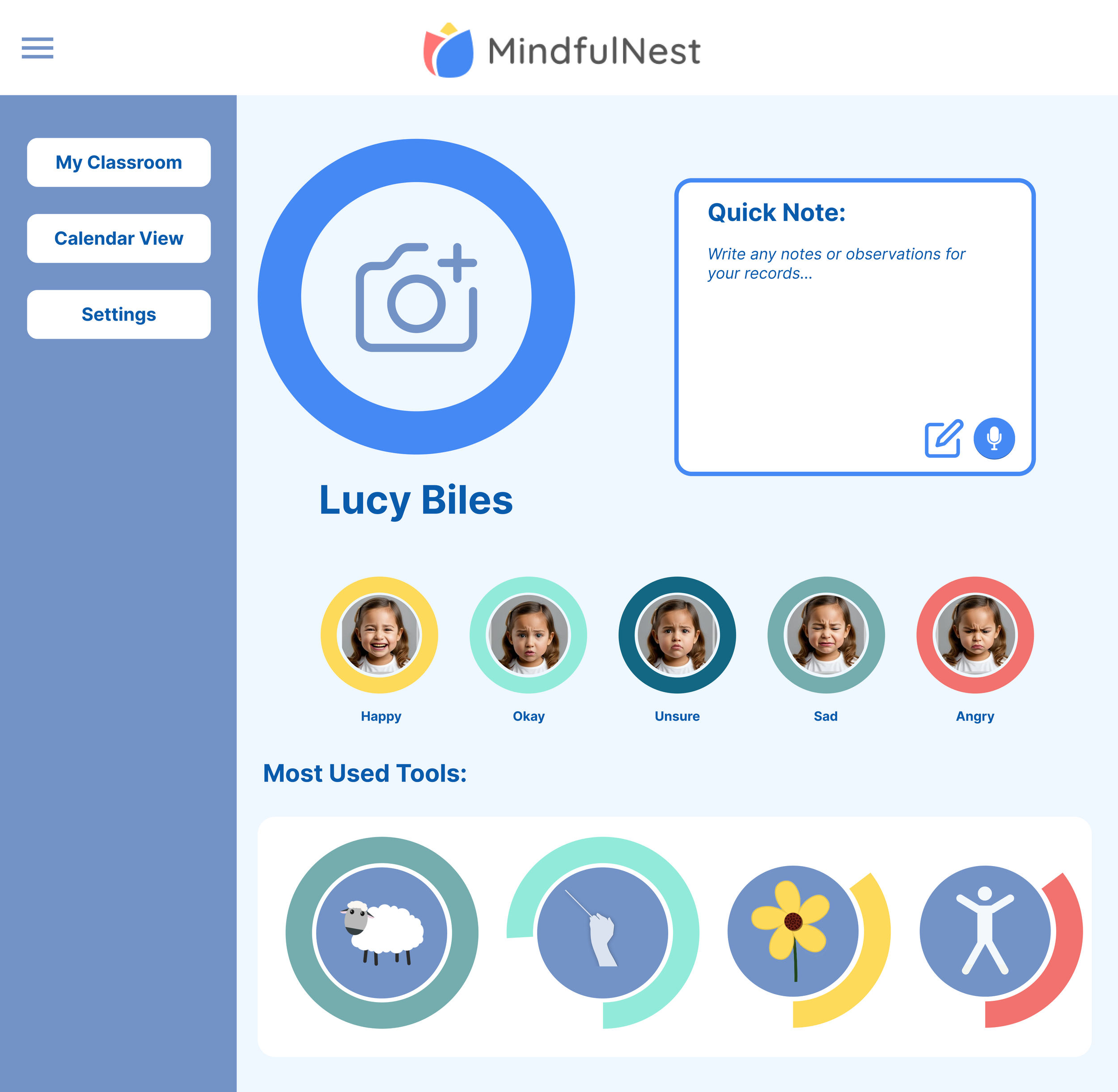
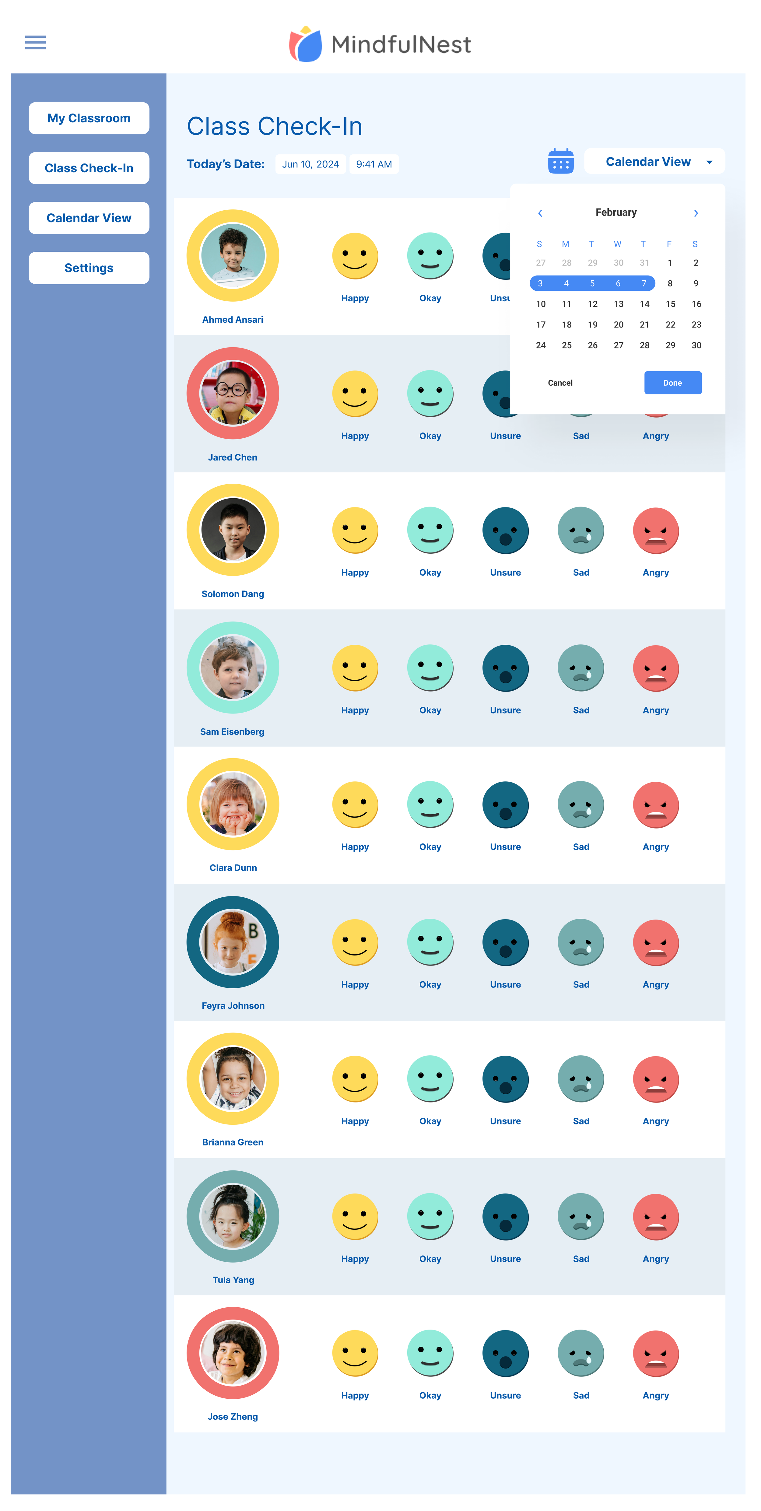
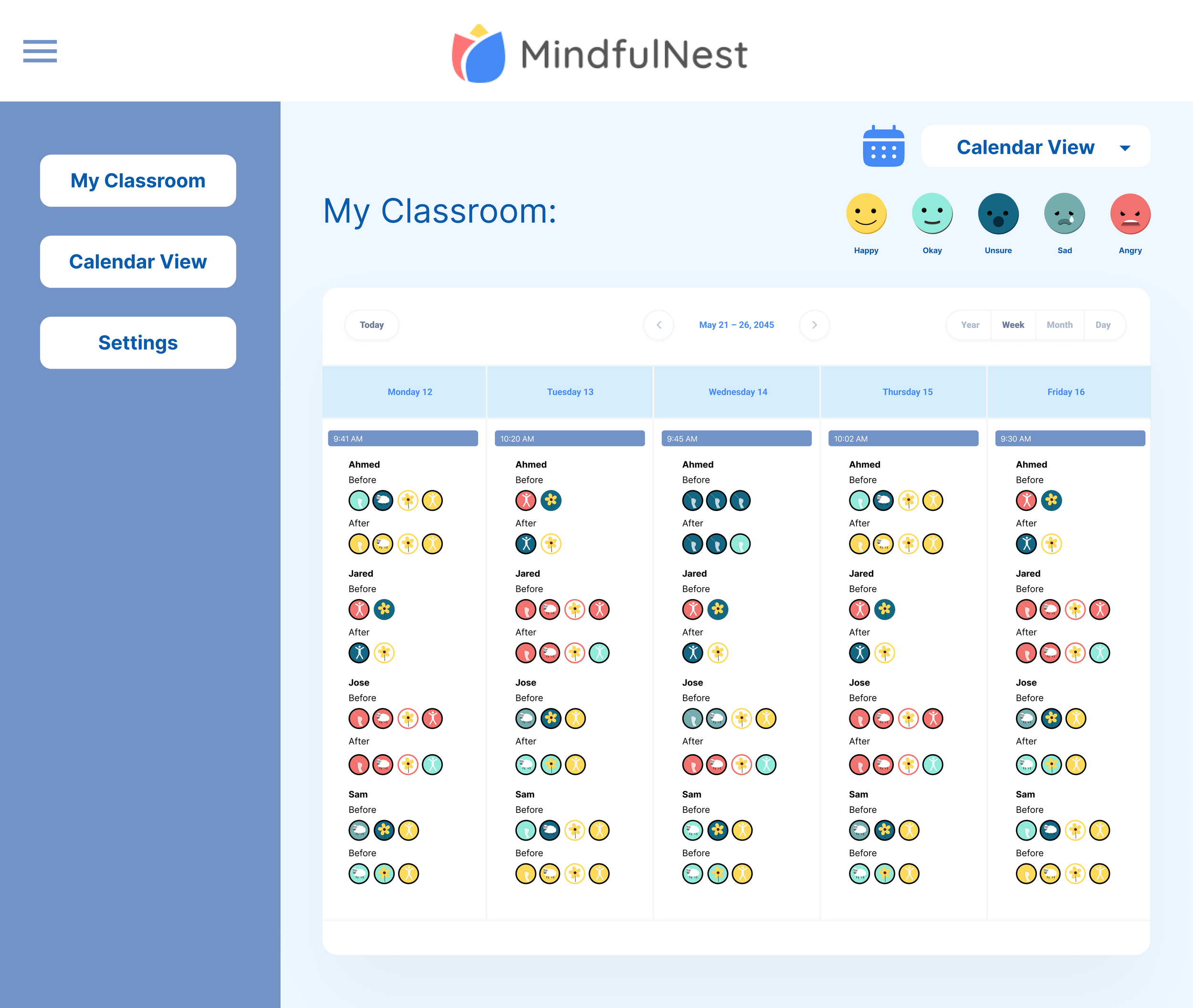
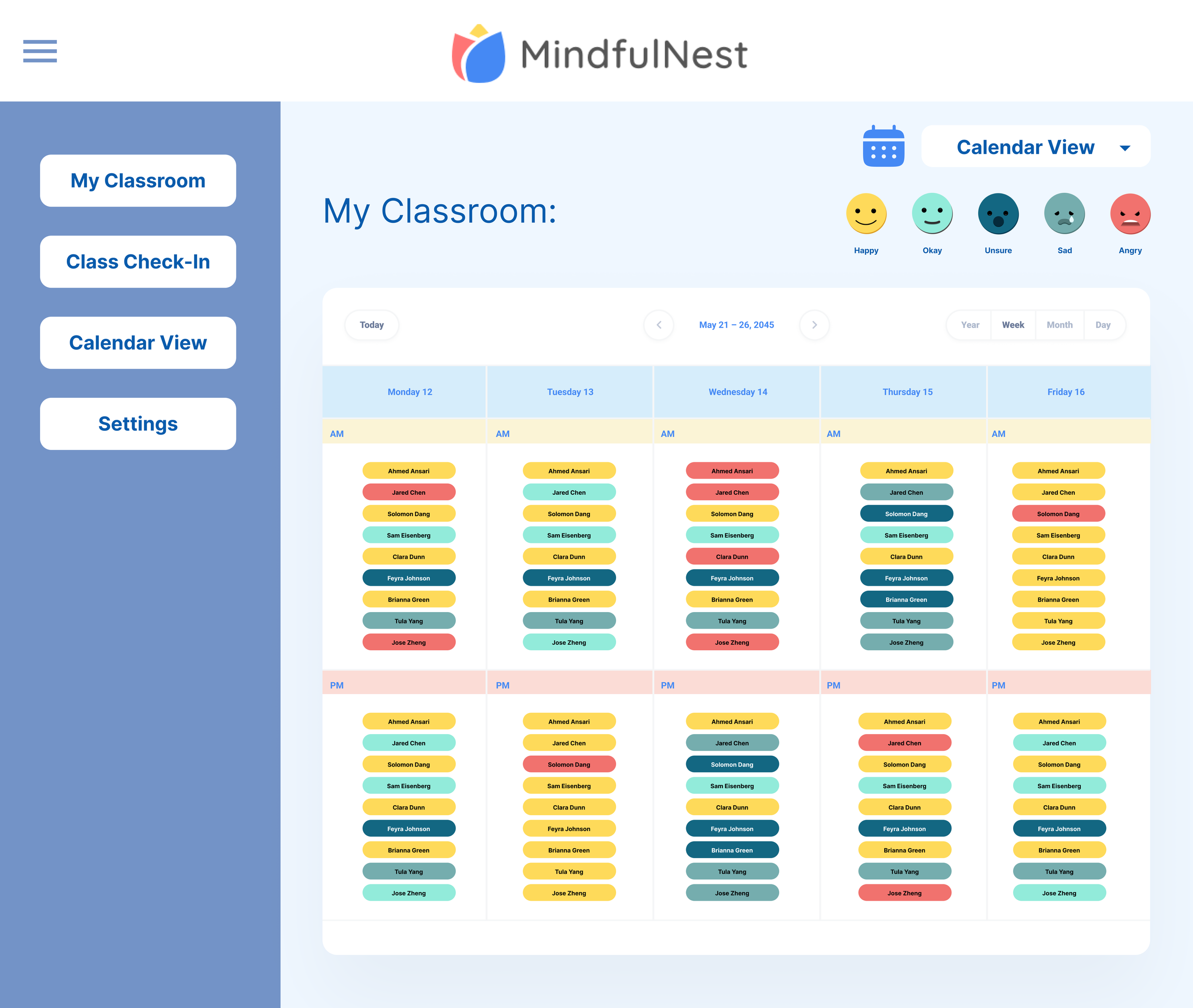
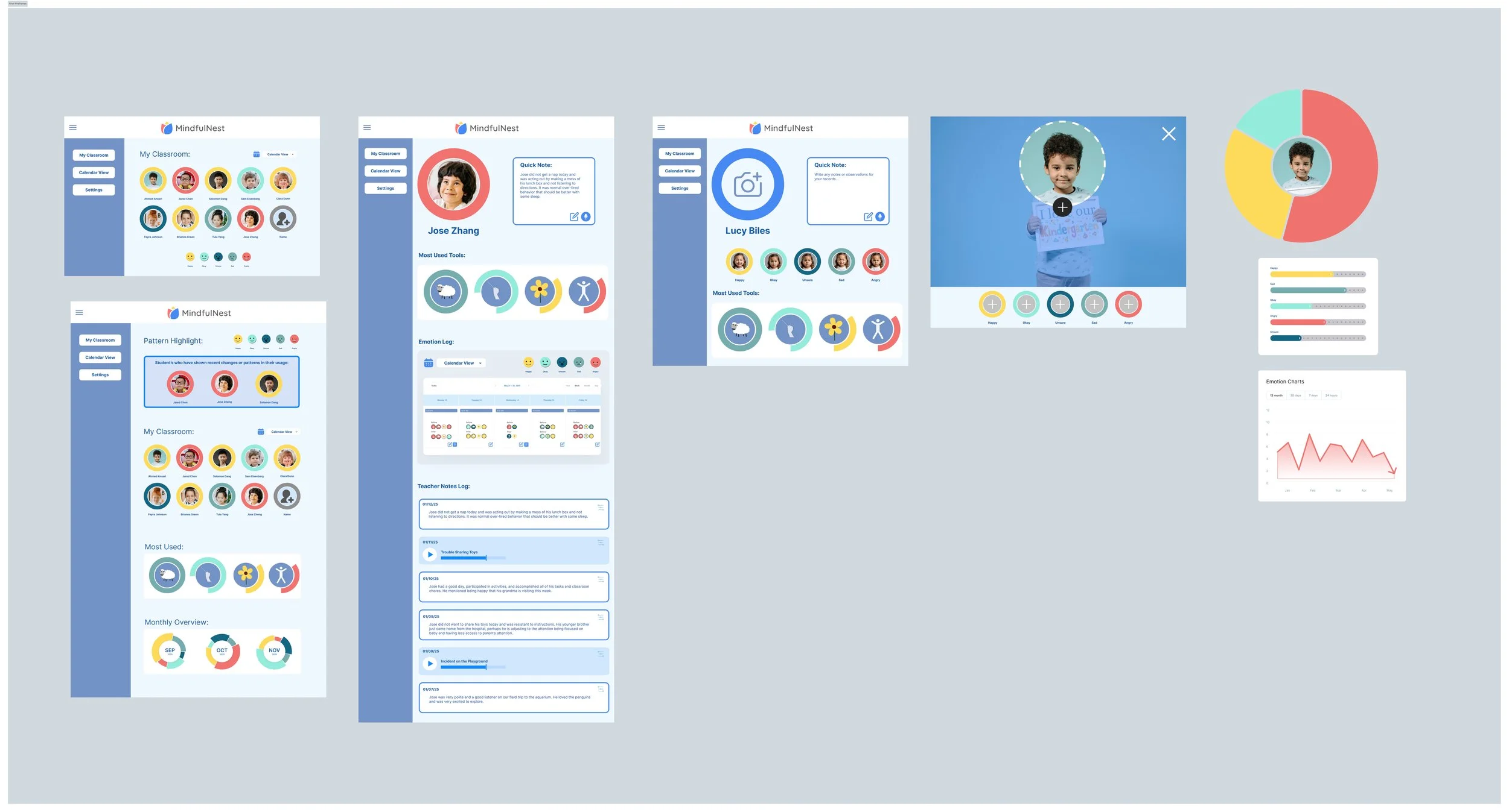
I began with lo-fi wireframes to explore how the teacher dashboard could track emotional data more effectively. I proposed more data tracking and customized note taking options that would support teachers with writing reports and parent-teacher conferences. We learned that adding emotion tracking to the morning check-in could undermine the intervention’s intent: to help students self-identify their emotions.
UX Exploration Insights:
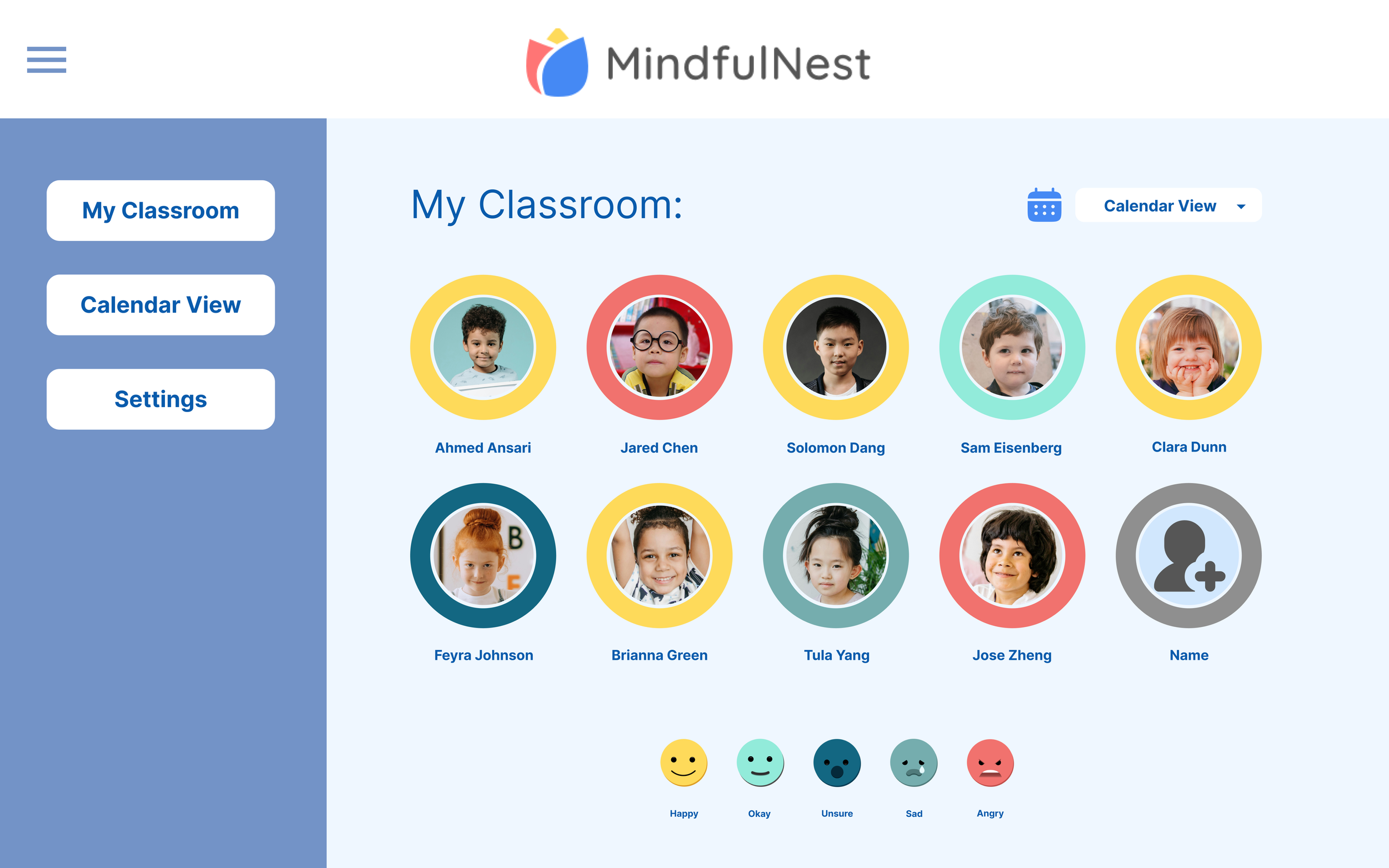
A dashboard showing current and historical emotional states
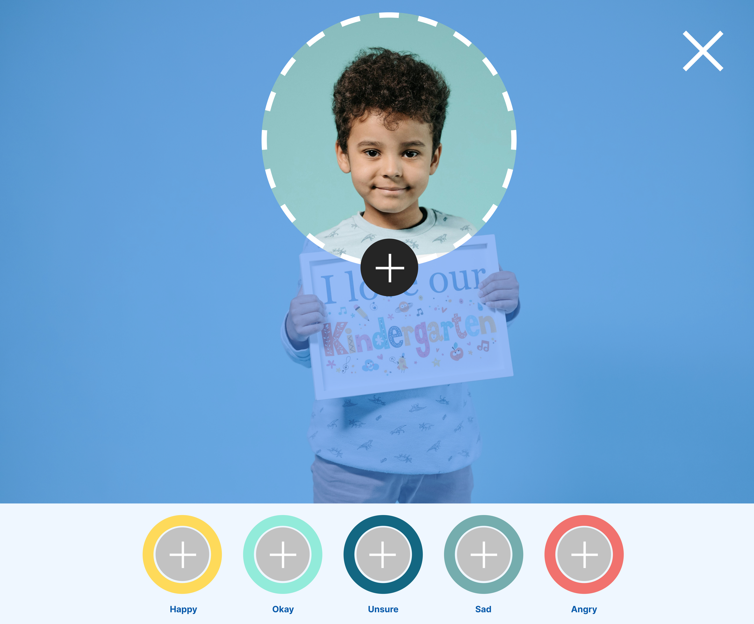
Student profiles visualizing emotions and SEL activities
Voice-to-text and timestamped notes for teacher documentation
A morning check-in feature with classroom-wide emotional snapshots
Iterations + User Testing
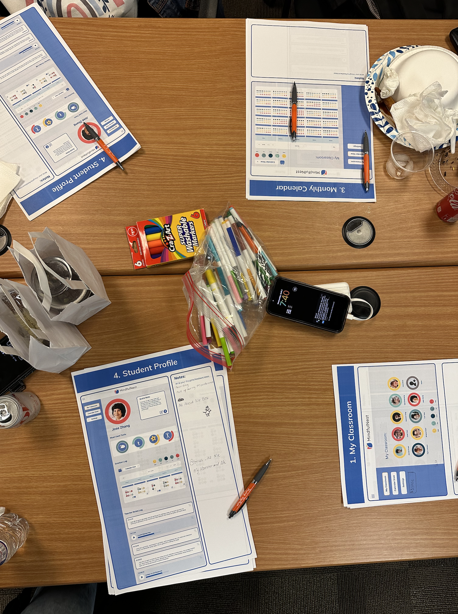
Team feedback recommended experimenting with multiple options for calendar view and data visualization. We held a workshop with the staff of MindfulNest’s partner nonprofit, TryingTogether, and presented these wireframes to teachers inviting them to add their feedback and make suggestions. Teachers expressed enthusiasm for immediate implementation of these features with one teacher exclaiming,
“I only have one question—how soon can we see this in the app?!”
Teachers loved the ability to see the frequent emotional data of students in order to quickly assess the emotional tone of the classroom. We heard a desire to flag students who may need attention at the top of the page and asked for clearer data visualization. A suggestion was made to have students make their own emotive faces for the emotion icons. We heard a need to integrate the data with other teacher administrative technologies for writing reports—a valid concern that was out of scope for this iteration.
Outcomes
This iterative process proved successful in the original ask to propose an updated UX for the teacher back-end of the app. While prototyping and integrating these changes is currently out of scope, the user feedback presented great potential and opportunity to improve and build upon the technology as a tool for teachers in addition to students.
MindfulNest currently does wonders to support the SEL development of children but there is an enormous opportunity to help teachers support that development through administrative data. The team was pleased with my contributions and I left them with a Figma file that could be iterated upon in the next phase.